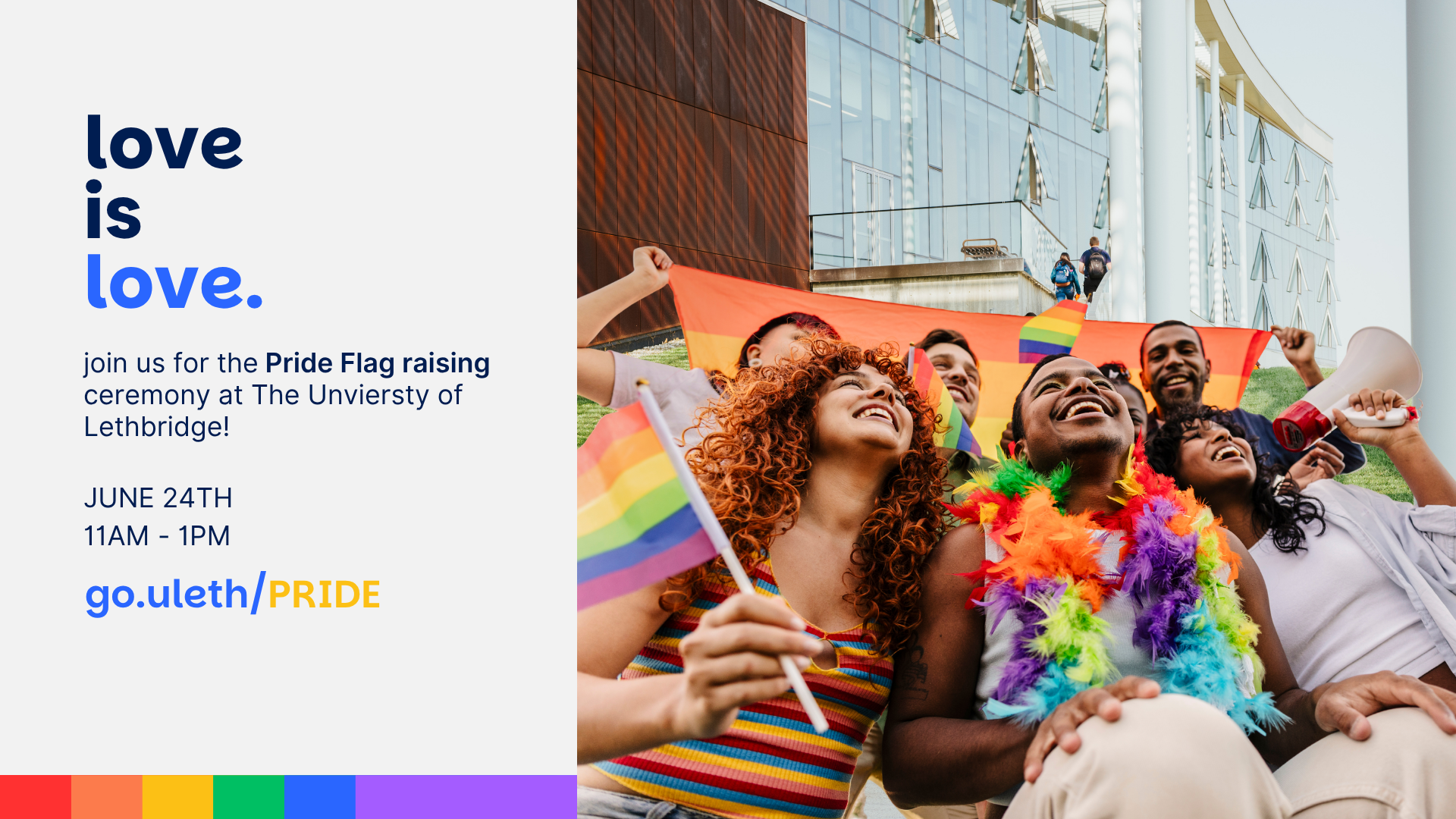
ULethbridge Pride - Branding
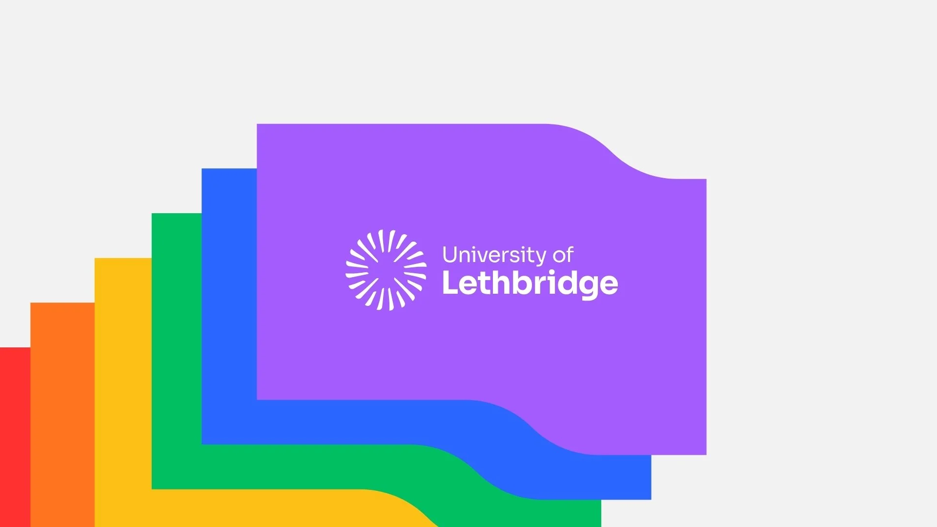
It was an honour to lead the design of the University of Lethbridge's new Pride brand system, creating a visual identity that celebrates inclusion while remaining deeply connected to the university's evolving institutional brand. The design draws inspiration from the distinctive coulee landscape that defines the university's identity, using its recognizable shape as the foundation of the mark.
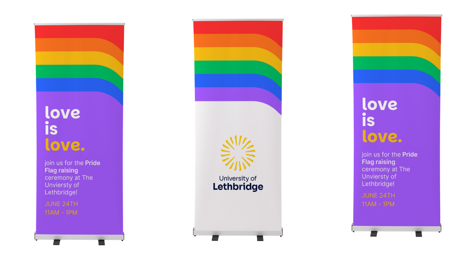
Throughout the project, scalability and versatility were key considerations. The identity was designed to remain impactful across a wide range of applications, from physical signage and merchandise to digital communications and social media. Its simple yet memorable form ensures strong recognition at any size, creating a flexible brand system that can continue to grow and evolve alongside the university's Pride initiatives for years to come.
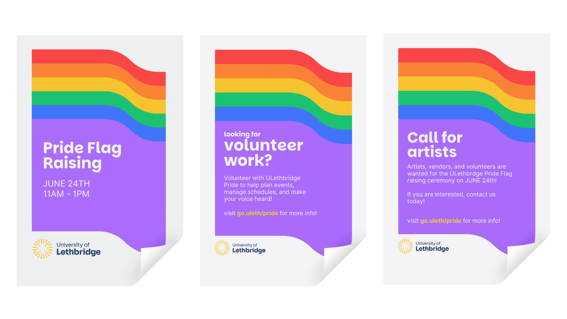
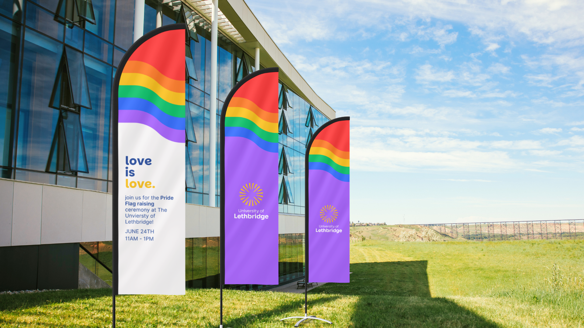
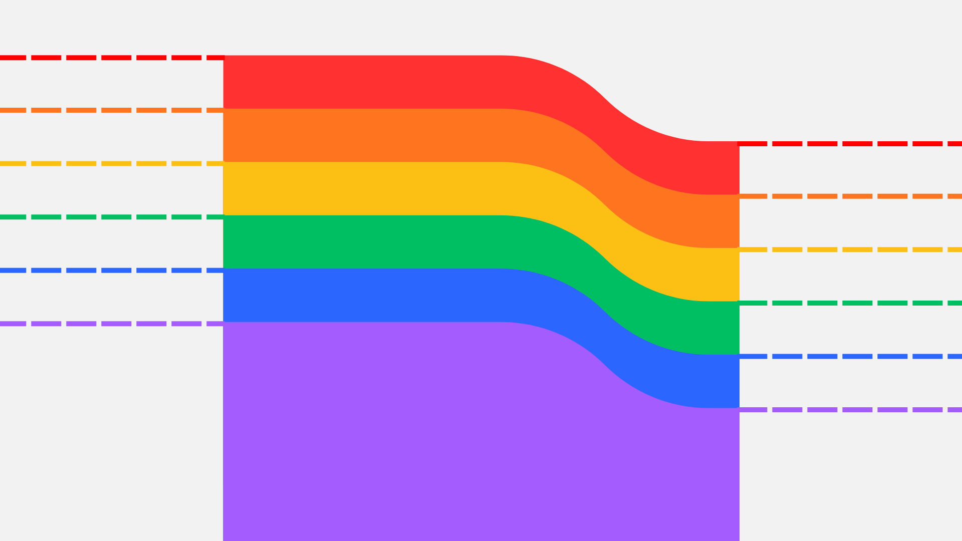
Beyond aligning with the broader institutional branding, the layered coulee forms were intentionally designed to evoke the movement of a waving flag. By stacking the six Pride colours within the shape, the identity captures a sense of visibility, celebration, and momentum while maintaining a strong connection to place. This approach allowed the Pride brand to feel both uniquely its own and unmistakably part of the University of Lethbridge family.
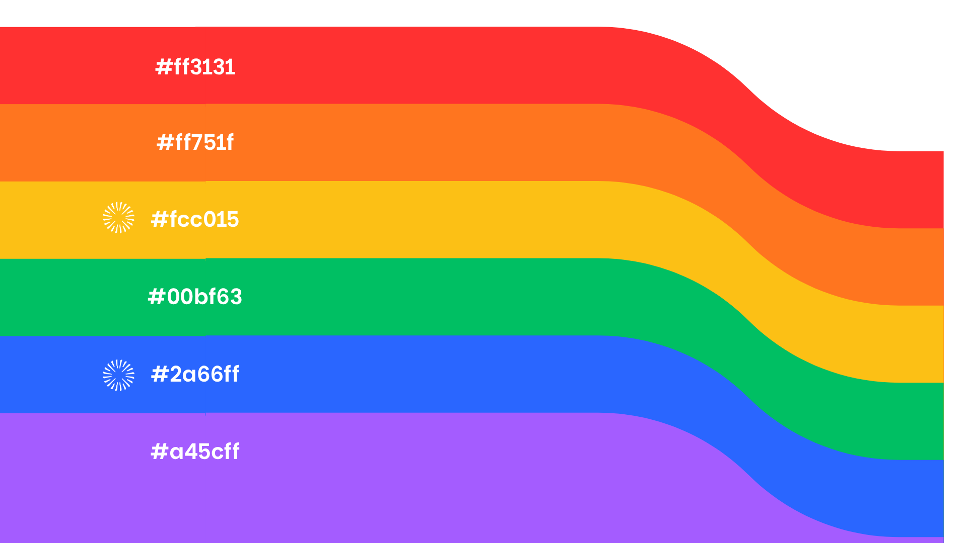
I developed a custom colour palette to thoughtfully integrate the university's signature blue and gold with the traditional Pride rainbow. Rather than simply placing the institutional colours alongside the existing spectrum, the rainbow palette was carefully refined to create a more cohesive and distinctive visual system. The result is a fresh interpretation of Pride colours that feels contemporary, recognizable, and uniquely representative of the university community.