20
communities
3
provinces
1
new brand
Stranville Living
BRAND DESIGN + SPATIAL DESIGN
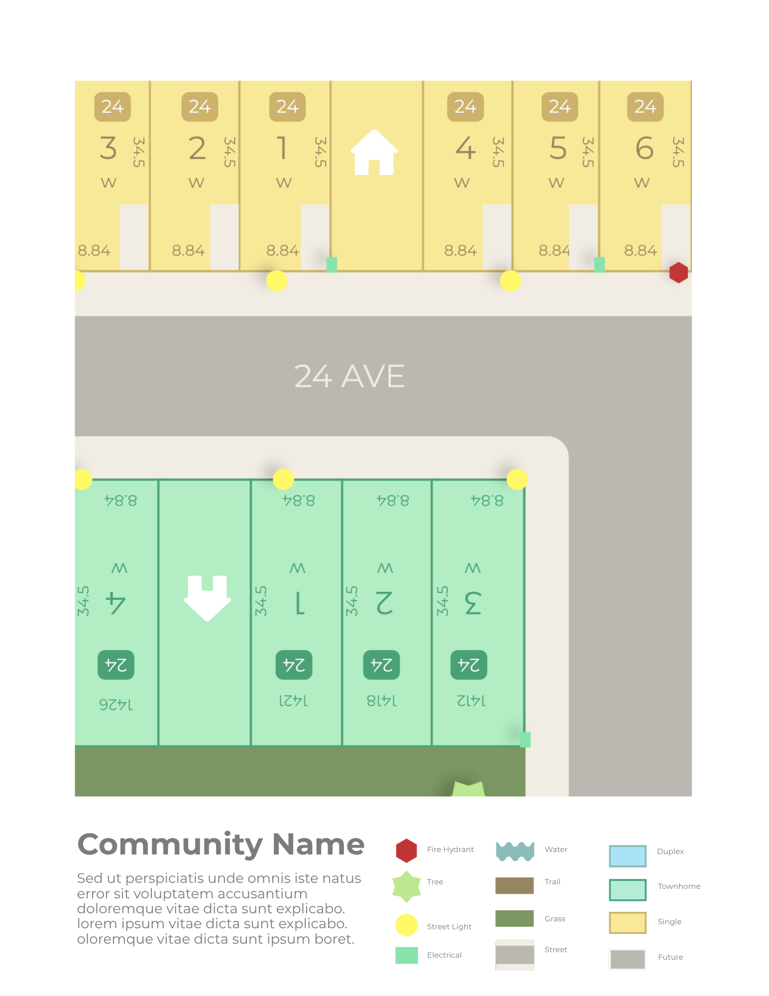
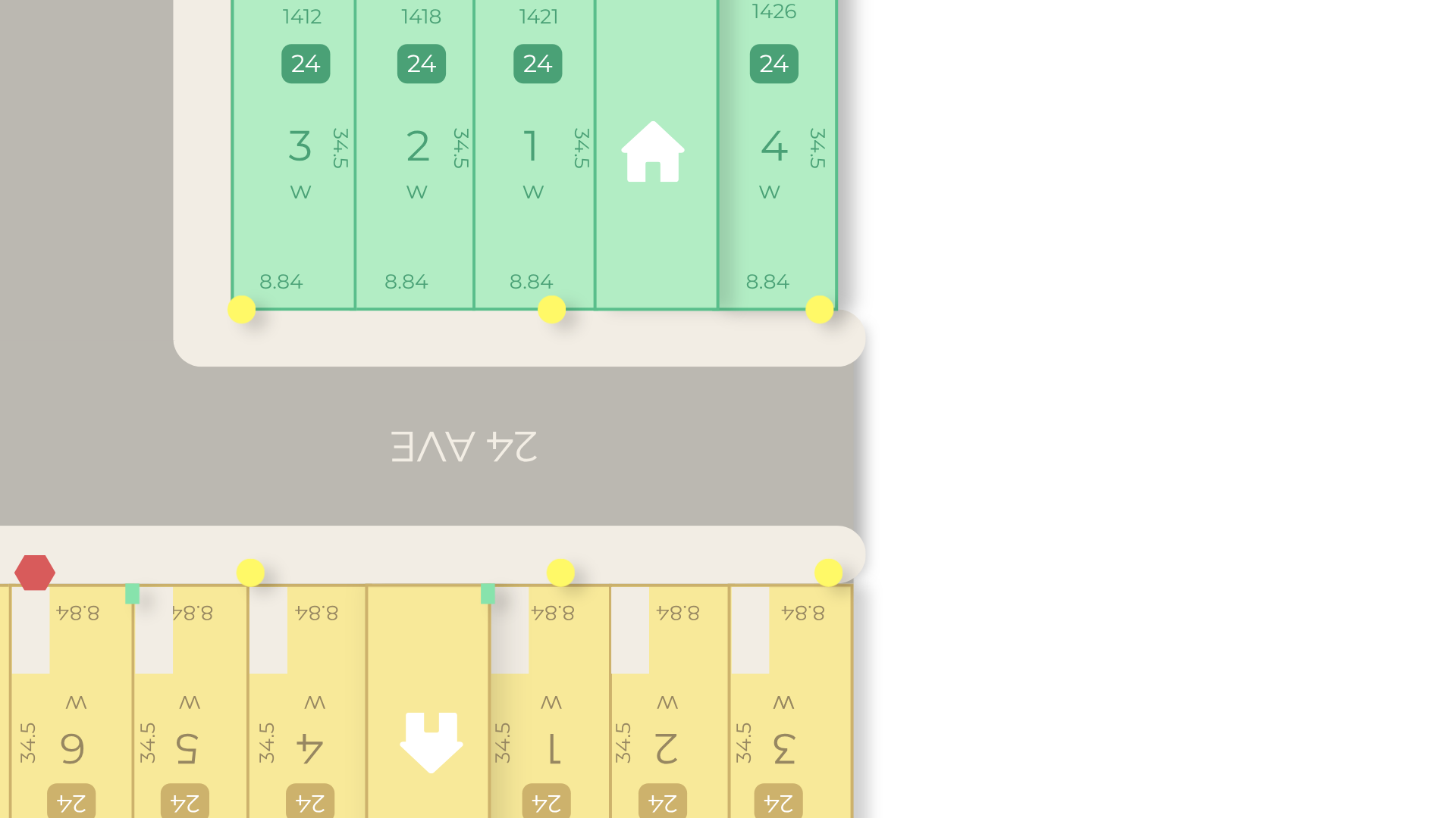
Stranville Living's commitment to "Building more than homes" informed the redesign of its community lot maps. The project focused on creating a cohesive visual language that reflects the brand's identity while making complex residential development information intuitive, accessible, and easy to navigate.
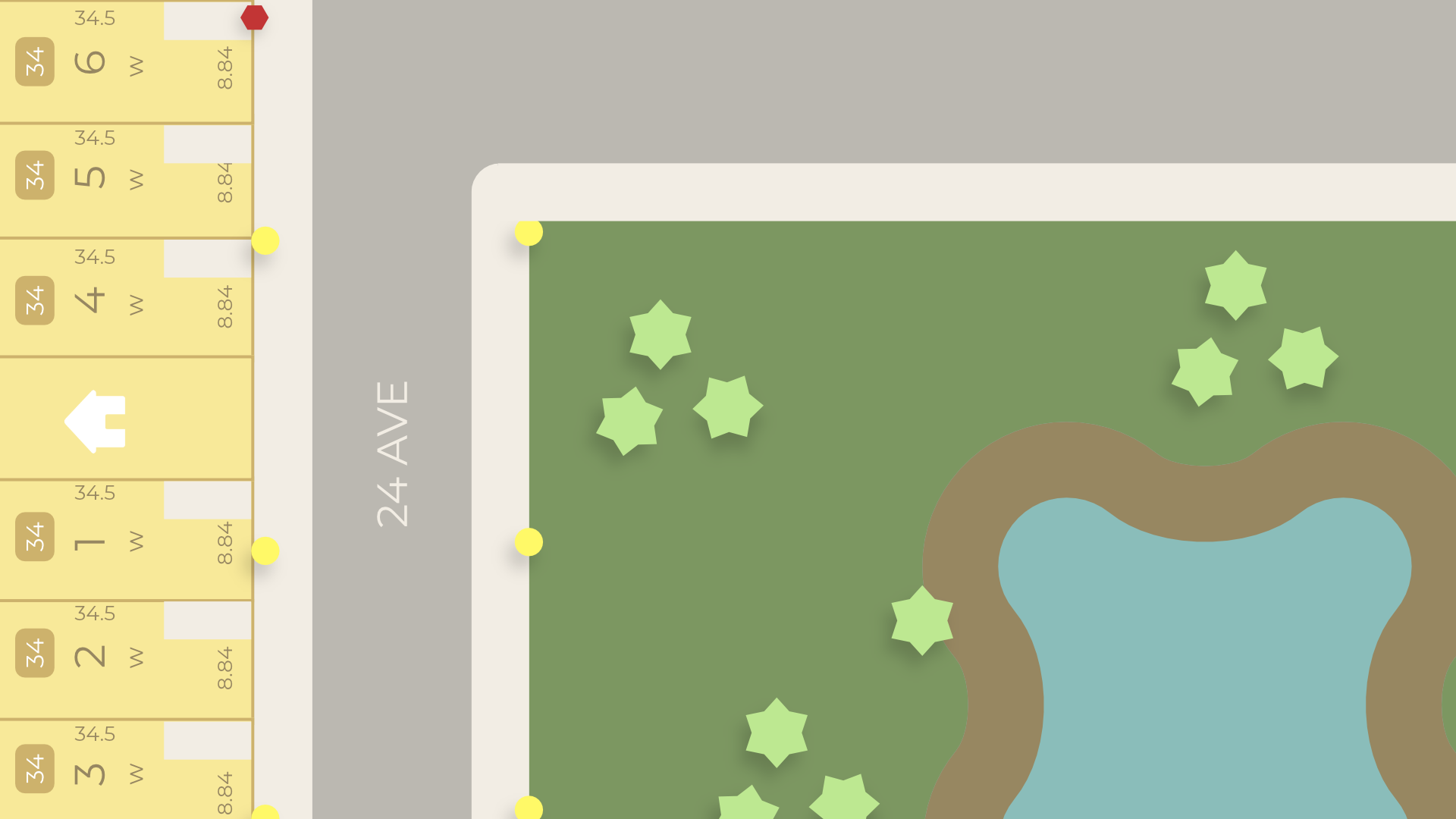
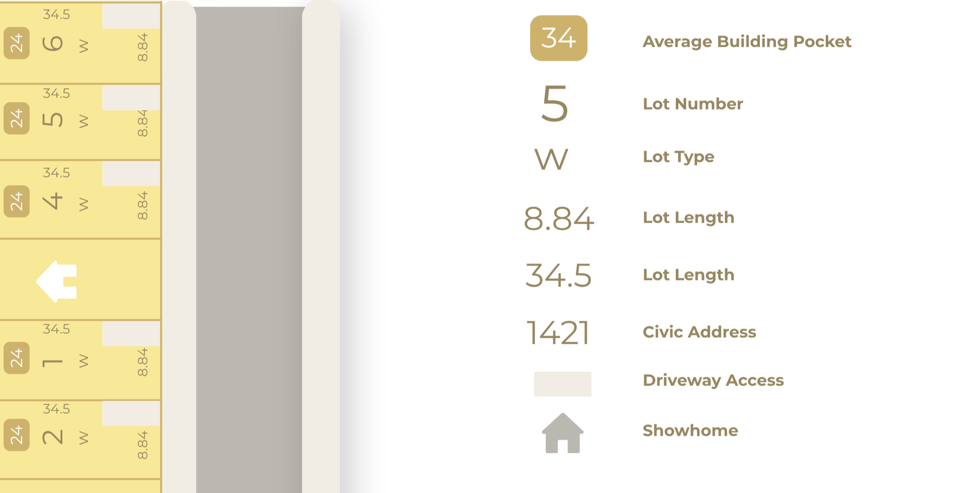
I developed a unified mapping system for 20 communities across Alberta, British Columbia, and Saskatchewan. Through a considered use of colour, typography, iconography, and spatial hierarchy, individual lot details, property types, infrastructure, and community features were organized into a clear and consistent visual framework. Each map balances technical accuracy with an approachable aesthetic, translating detailed site information into an accessible visual experience.
Brand Voice
Brio's brand voice is warm, charming, and quietly confident. It's the sound of a friend who always knows the right person to book, never talks down to you, and makes a little luxury feel like part of a normal week.
How Brio Sounds:
Like a friend who knows things. The copy reads like a tip from your most put-together friend, not an ad. It tells you what's worth booking and why, and leaves out the sales pitch.
Warm, never stuffy. No spa jargon and no intimidating beauty-speak. Brio talks about treatments the way you'd talk about them over coffee, and everyone feels welcome in the room.
Confident without shouting. The brand doesn't need loud promos or big claims. It trusts you to get it, and if you know, you know.
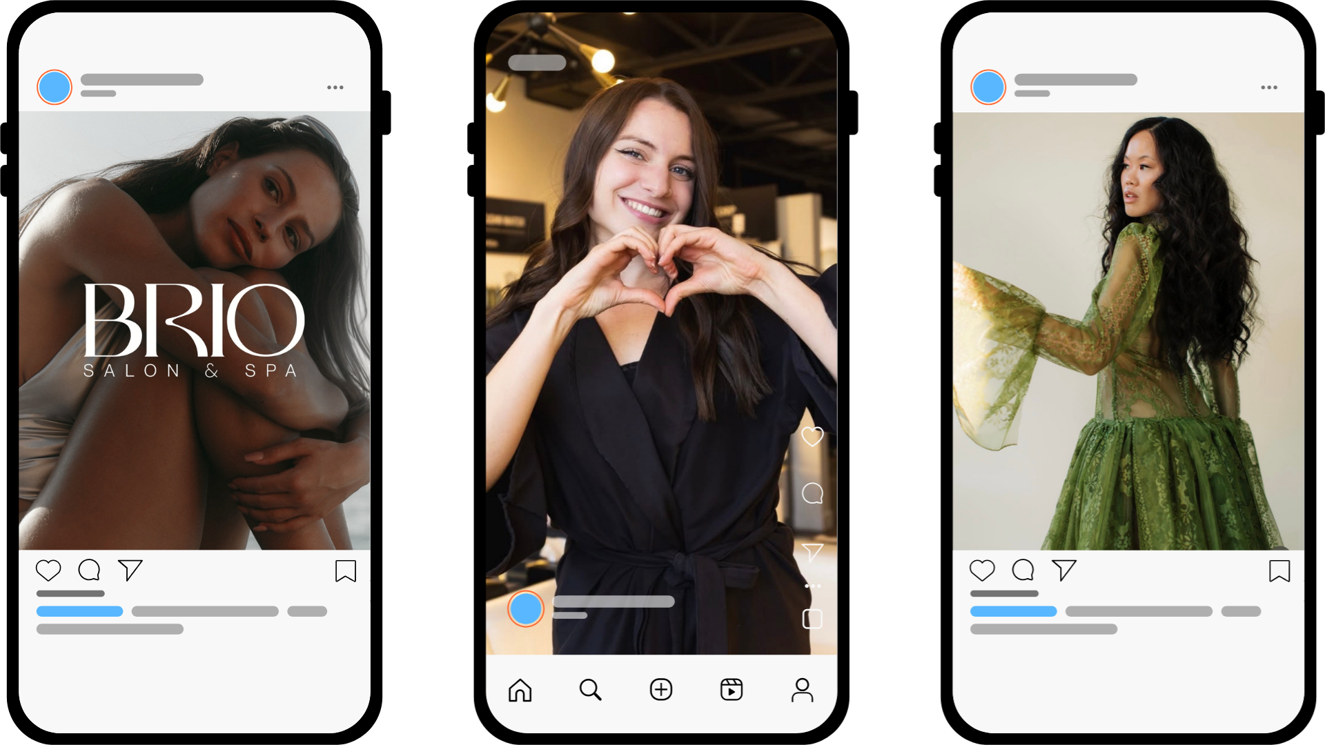
The launch campaign generated over 200K impressions across Instagram, Facebook, and Google Ads. The Campaign focused on highlighting the rebrand while also shifting their visuals towards more purposeful, luxury in-house photography and visuals during the winter 2025 season. Google Das were targeted at audiences 18-30 in and around Southern Alberta, resulting in a 35% booking increase during the winter season, as the rebrand connected with a younger audience while retaining the trusted clientele the salon has serviced for the last two decades.
Environmental Design
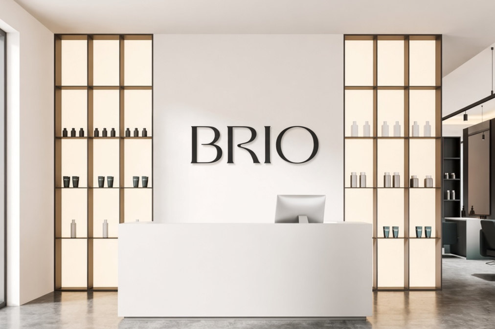
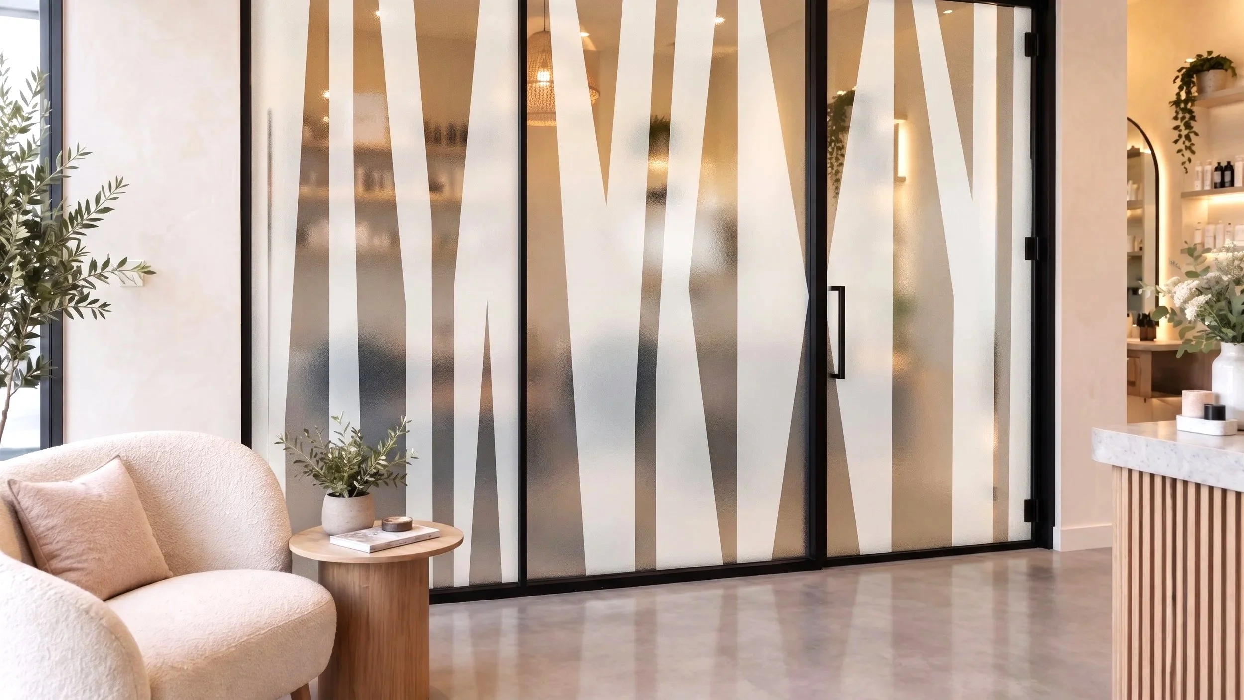
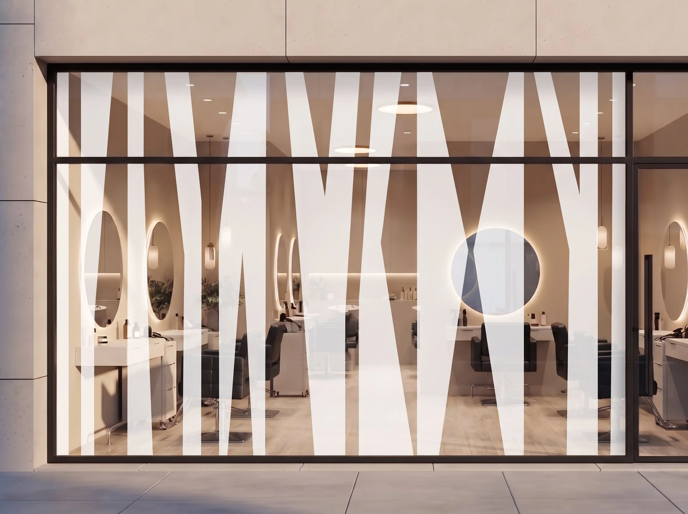
This brand was designed to be felt physically. A host of graphics and images allow the space to be equally as transformed as the digital presence, with a focus on neutral, organic visuals.
As Brio prepares to leave their 2nd Avenue location, maintaining the physical presence of its iconic sign is more important than ever. Utilizing the graphic on windows both inside and out helps keep that brand recognition in their new location, and keeps their unique identity at the forefront of their space.
What Brio Stands For:
Everyday luxury. Quality products, skilled hands, and a space that feels special, all without the price tag or the attitude that usually comes with it.
A voice that shows up everywhere. The same tone carries across the website, social, booking emails, and signage, so Brio sounds like itself at every touchpoint.
Hospitality you can feel. The warmth in the copy carries into the space itself, from the greeting at the desk to the small details in the treatment rooms.

The Launch Campaign
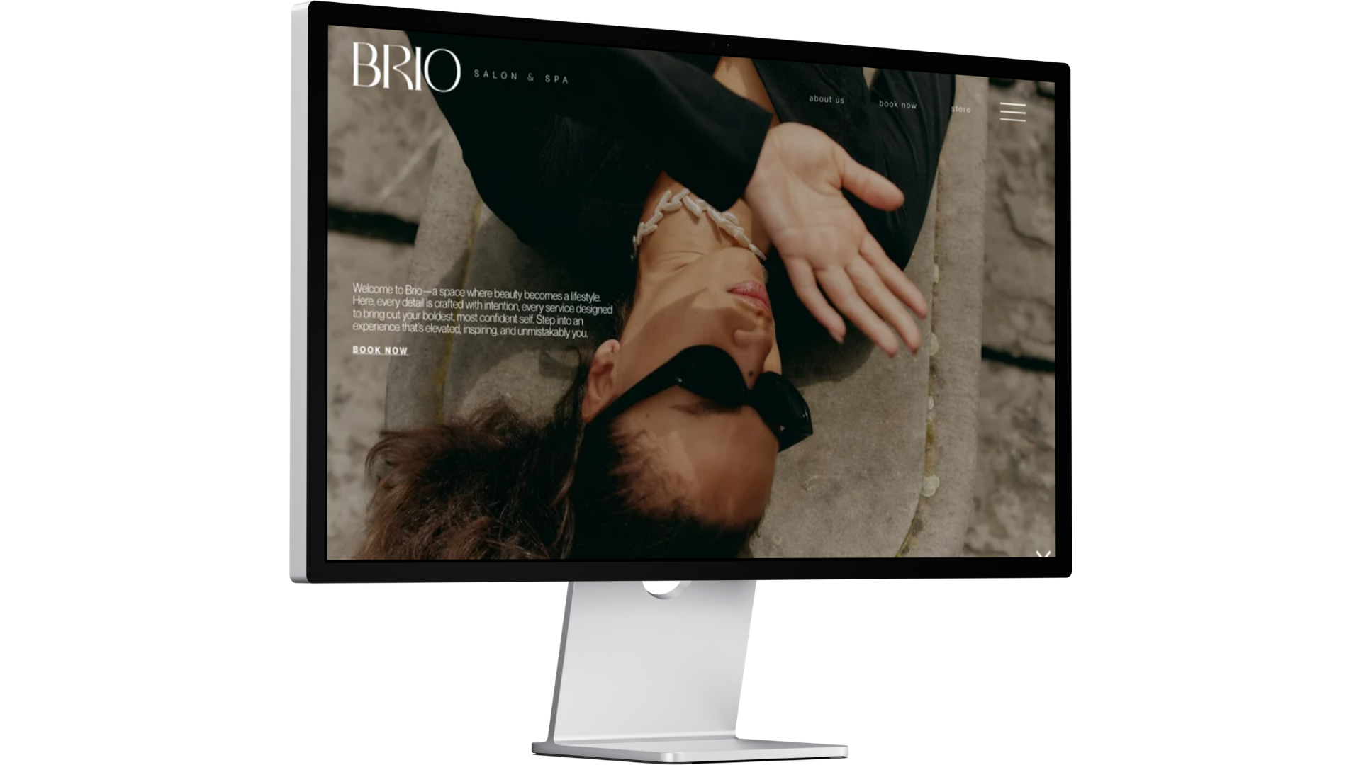
The rebrand extended across every customer touchpoint, from the development of a new salon and spa menu to branded packaging, apparel, and promotional materials designed to transform Brio from a service-based business into a complete lifestyle experience. Social media became a key extension of this identity, with a strategy focused on capturing in-house photography that reflected the new art direction while seamlessly integrating carefully selected stock imagery. This created a cohesive digital presence that felt intentional, elevated, and recognizable across every platform.
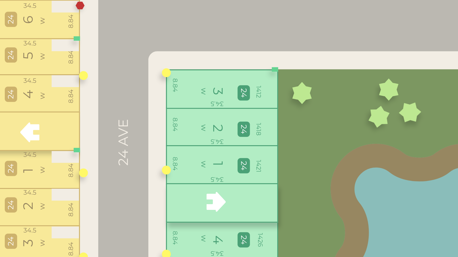
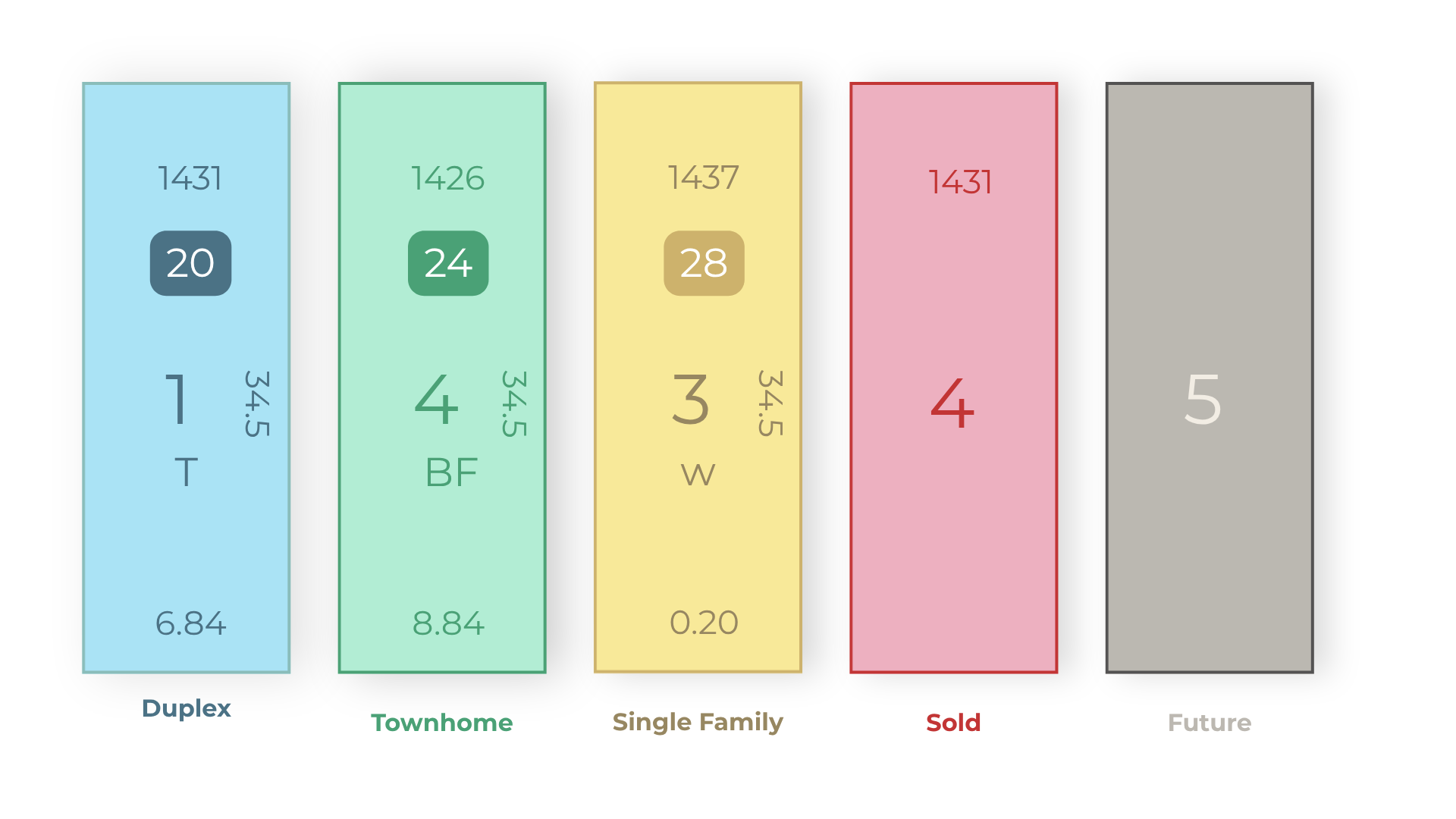
By purposefully utilizing the Stranvillle palette where possible, this design presents comprehensive lot details with absolute clarity, ensuring that from the very first glance, the viewer feels the confidence and quality of a Stranville build.
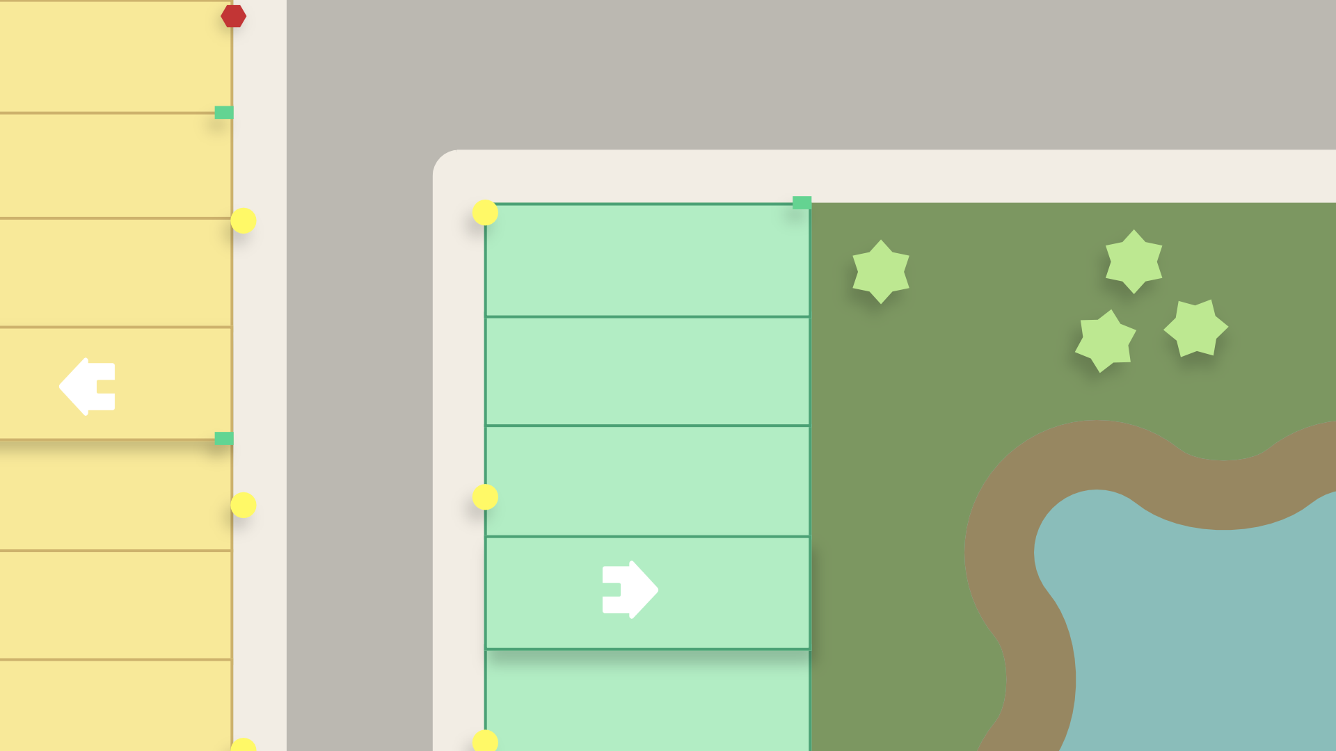
The map includes 3 dimensional elements to seamlessly communicate crucial lot information, such as showhome location, and adds shadows to elements like trees and streetlamp to inform height differences.