Lethbridge Fashion Week - Full Rebrand
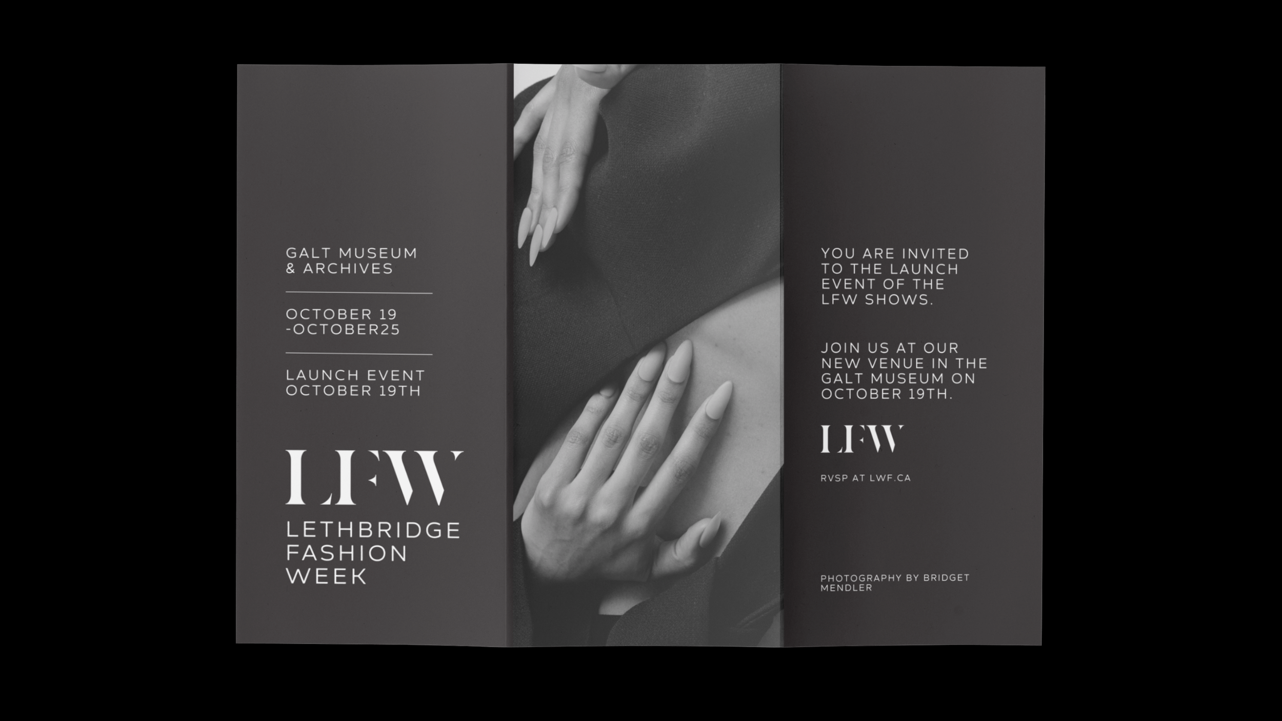
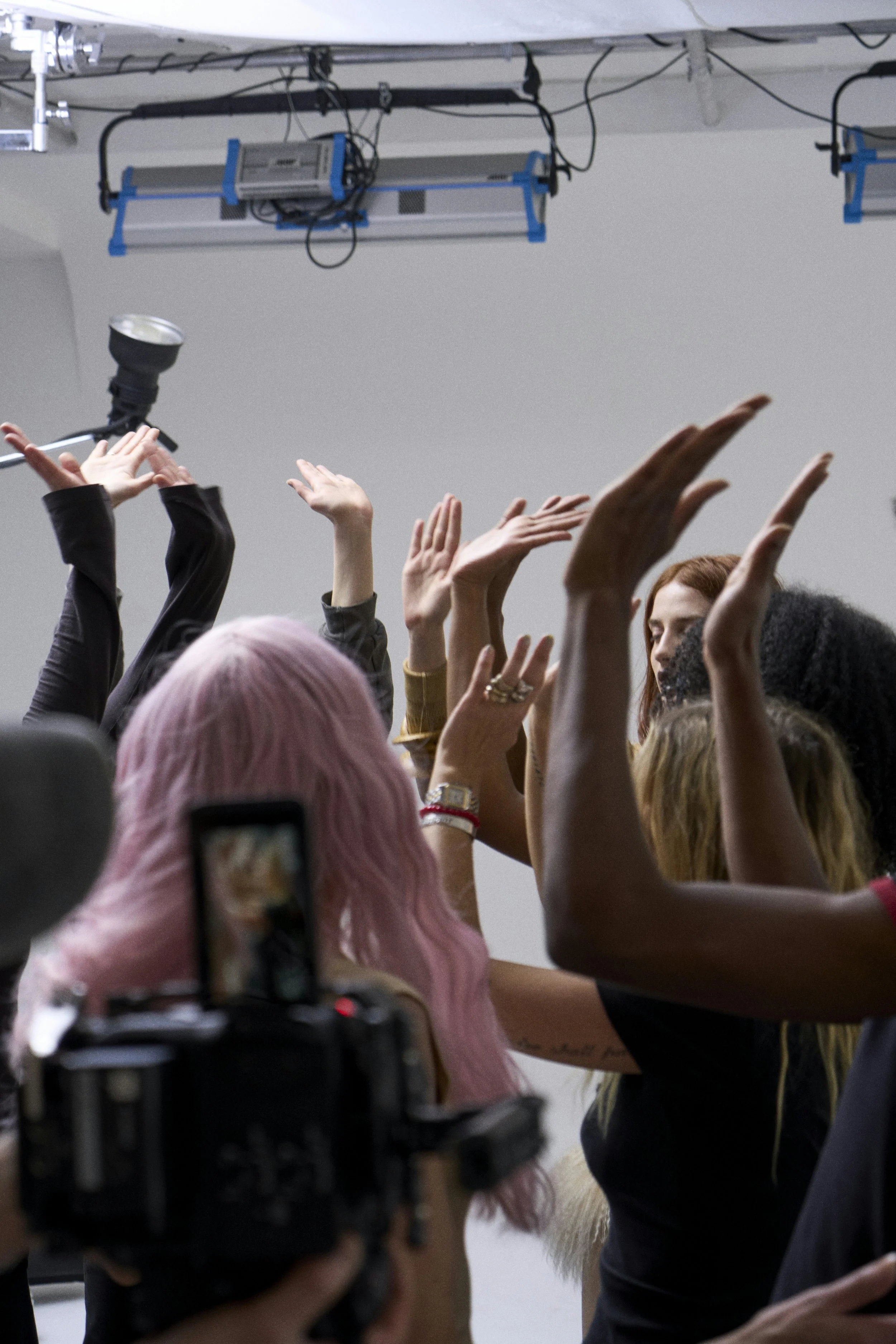
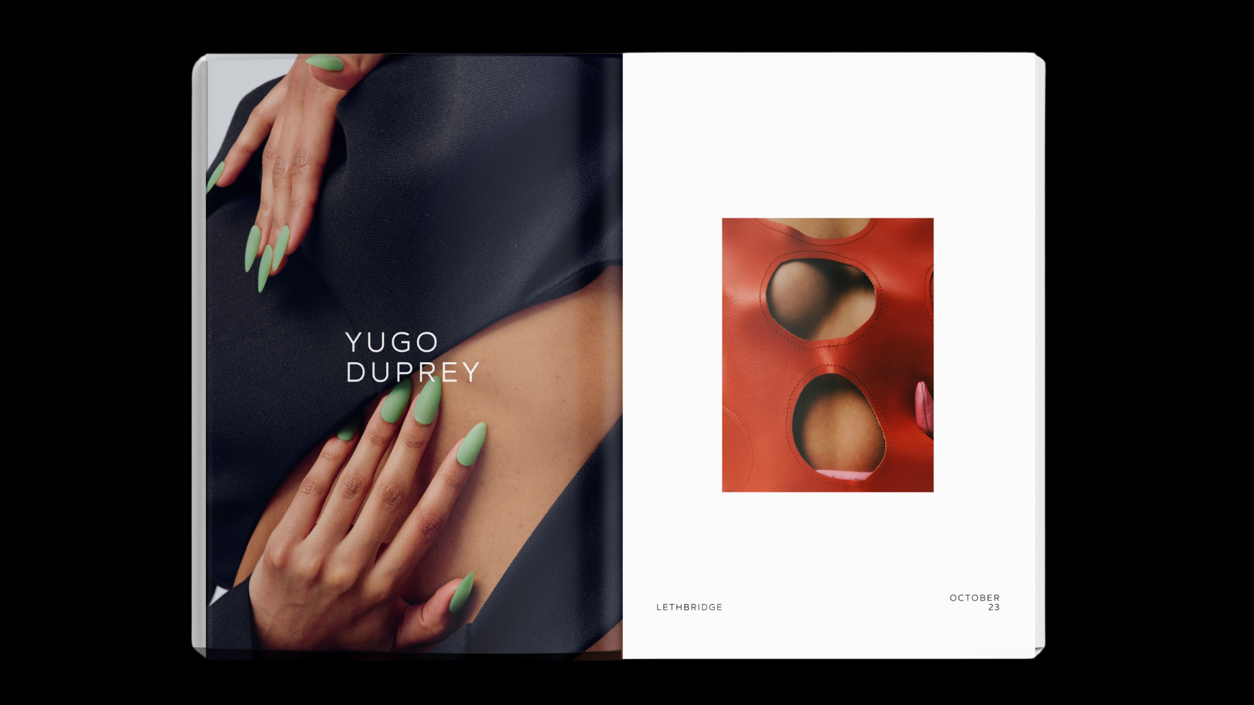
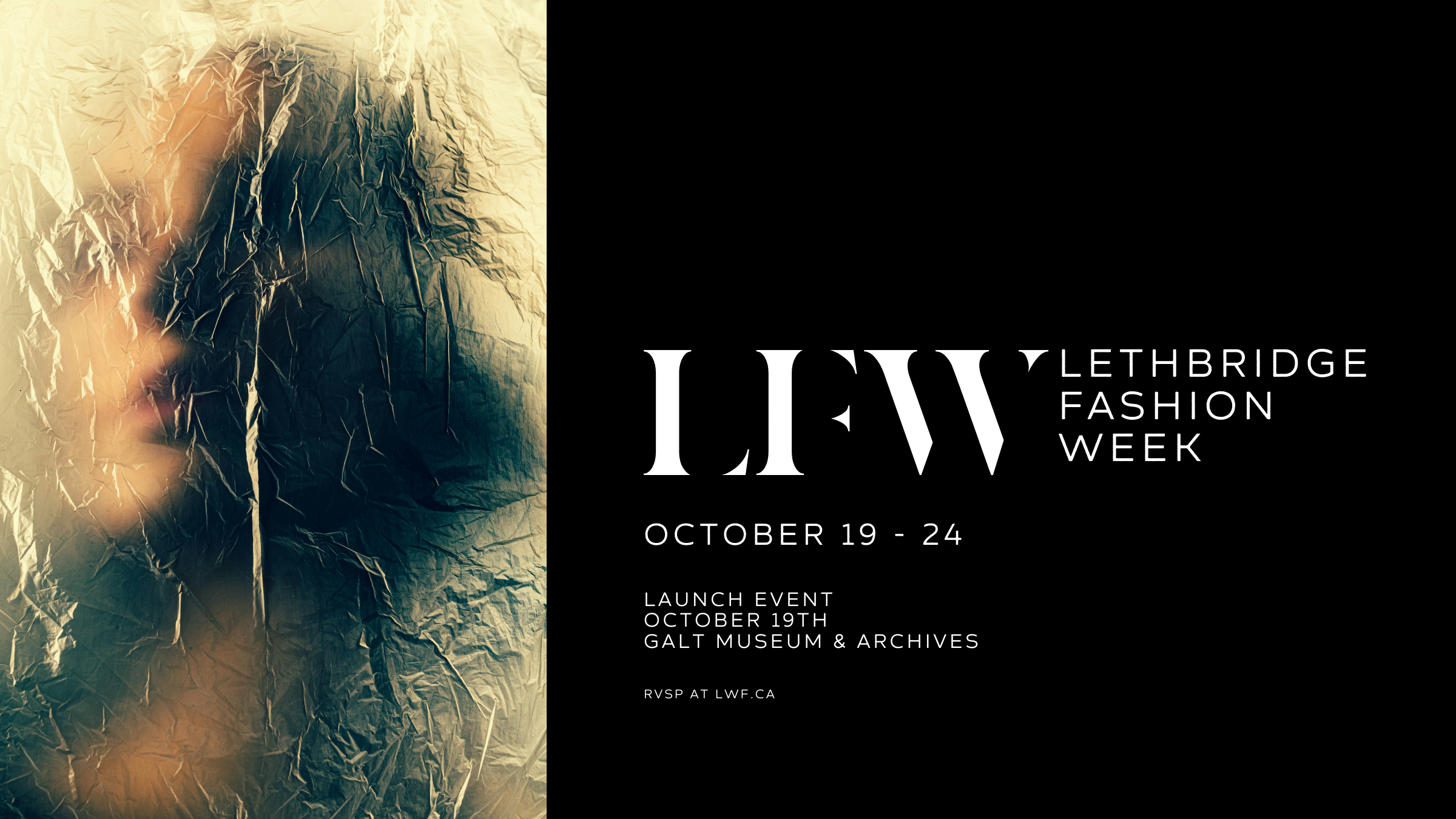
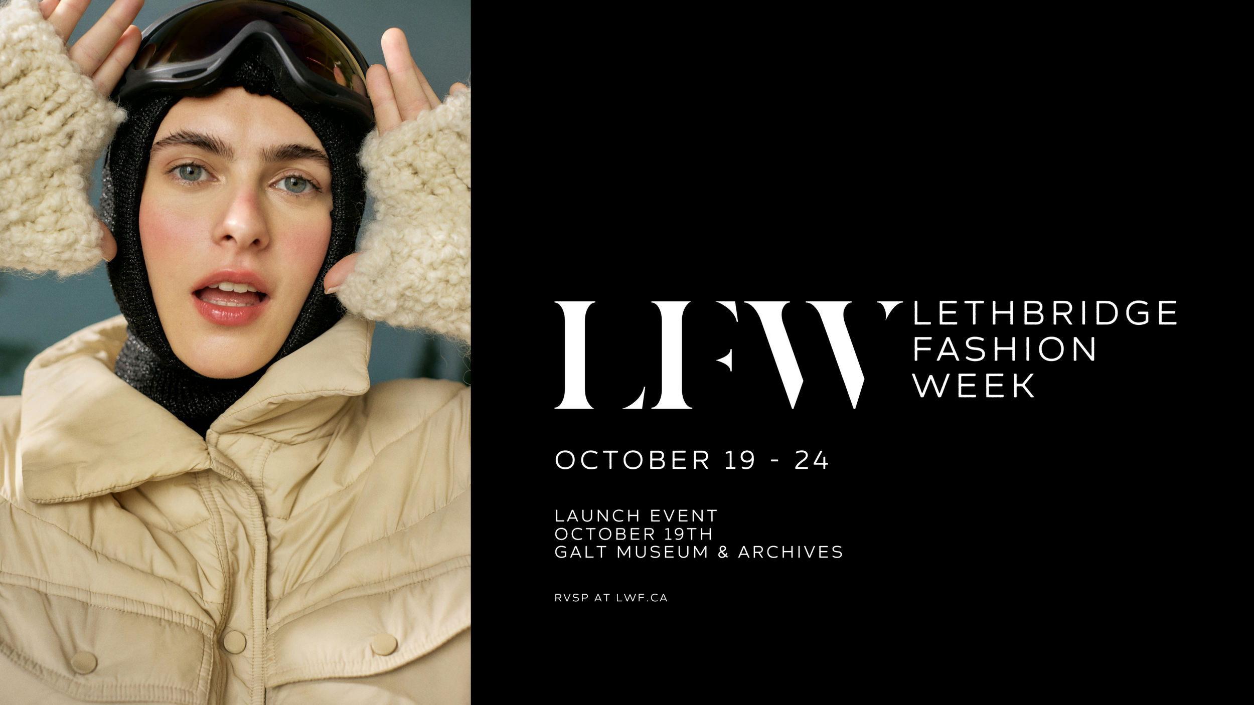
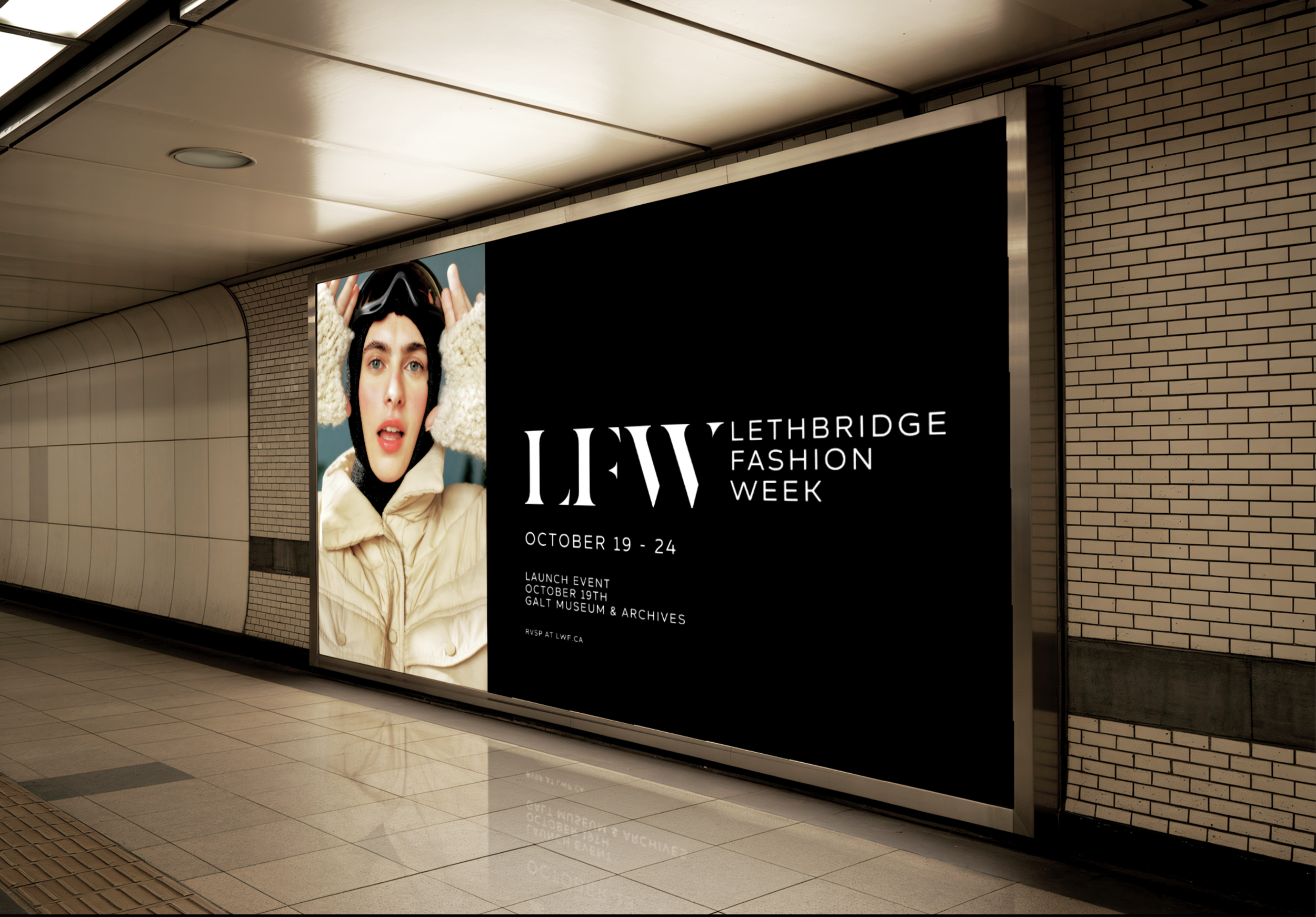
Designing a new brand for Lethbridge Fashion Week meant creating a visual identity that feels elegant and editorial while leaving space for the diverse creative voices the event celebrates. The art direction leans into ambiguity rather than literal fashion imagery, using refined forms, tonal contrast, and sophisticated layouts that evoke the spirit of fashion without visualizing garments or trends outright. This approach ensures the branding feels elevated and cohesive but never competes with the individual aesthetics of the participating designers, models, and artists, allowing them to shine on their own terms. The result is a brand system that feels timeless, adaptable, and respectful of the creative expression at the heart of the week’s programming, supporting inclusivity and diversity within the local fashion community.
The visual system leans heavily into black as a primary colour, chosen for its neutrality and ability to coexist with any artist’s vision without competing for attention. Typography plays a key role in creating contrast and refinement, pairing a reduced, elegant serif with a clean sans serif to balance editorial sophistication with clarity. This restrained approach creates visual interest through tension and hierarchy rather than decoration, allowing the branding to frame the work of participating artists without overshadowing it.