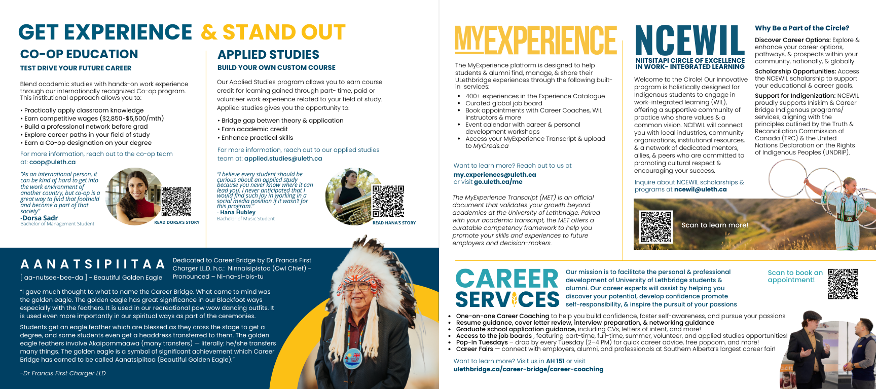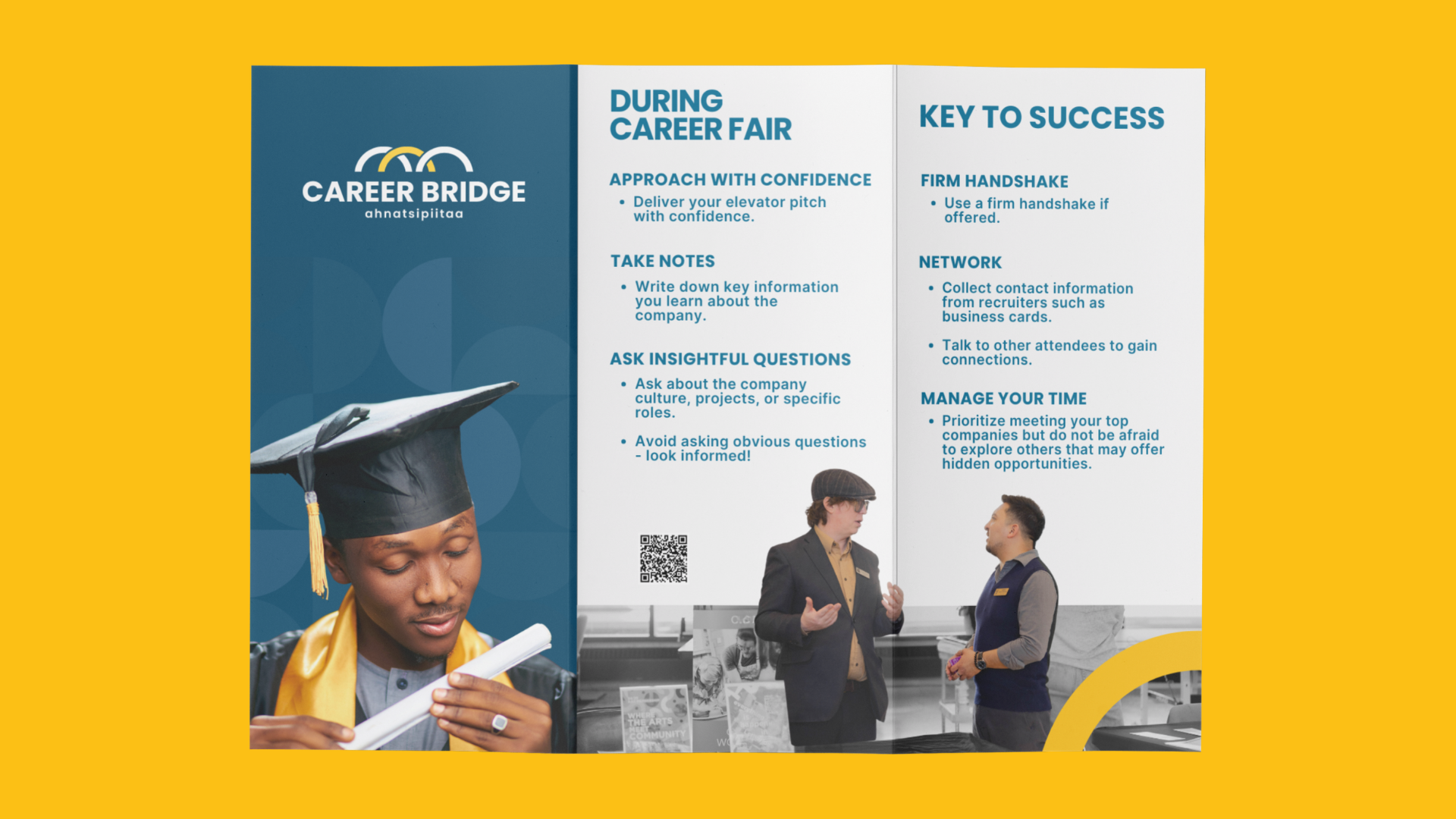
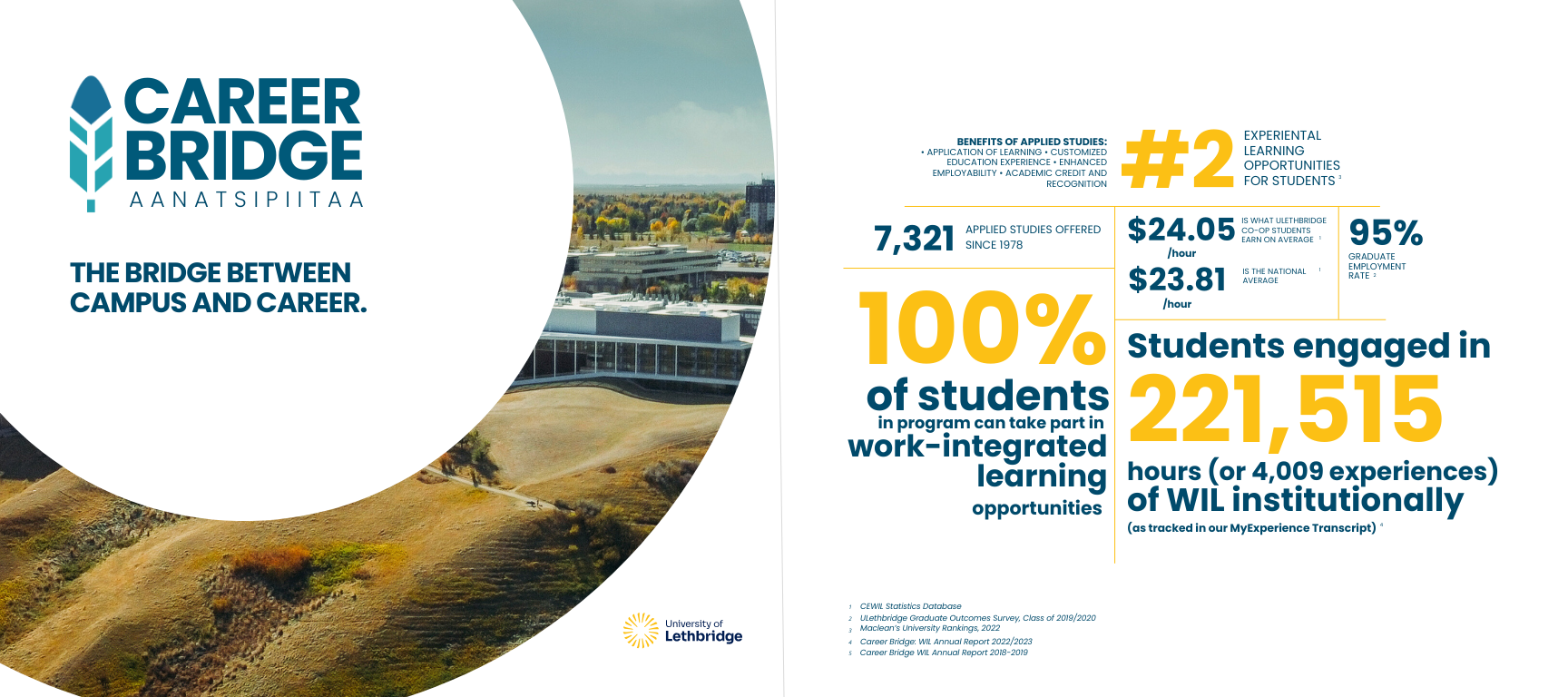
Career Bridge - Full Branding
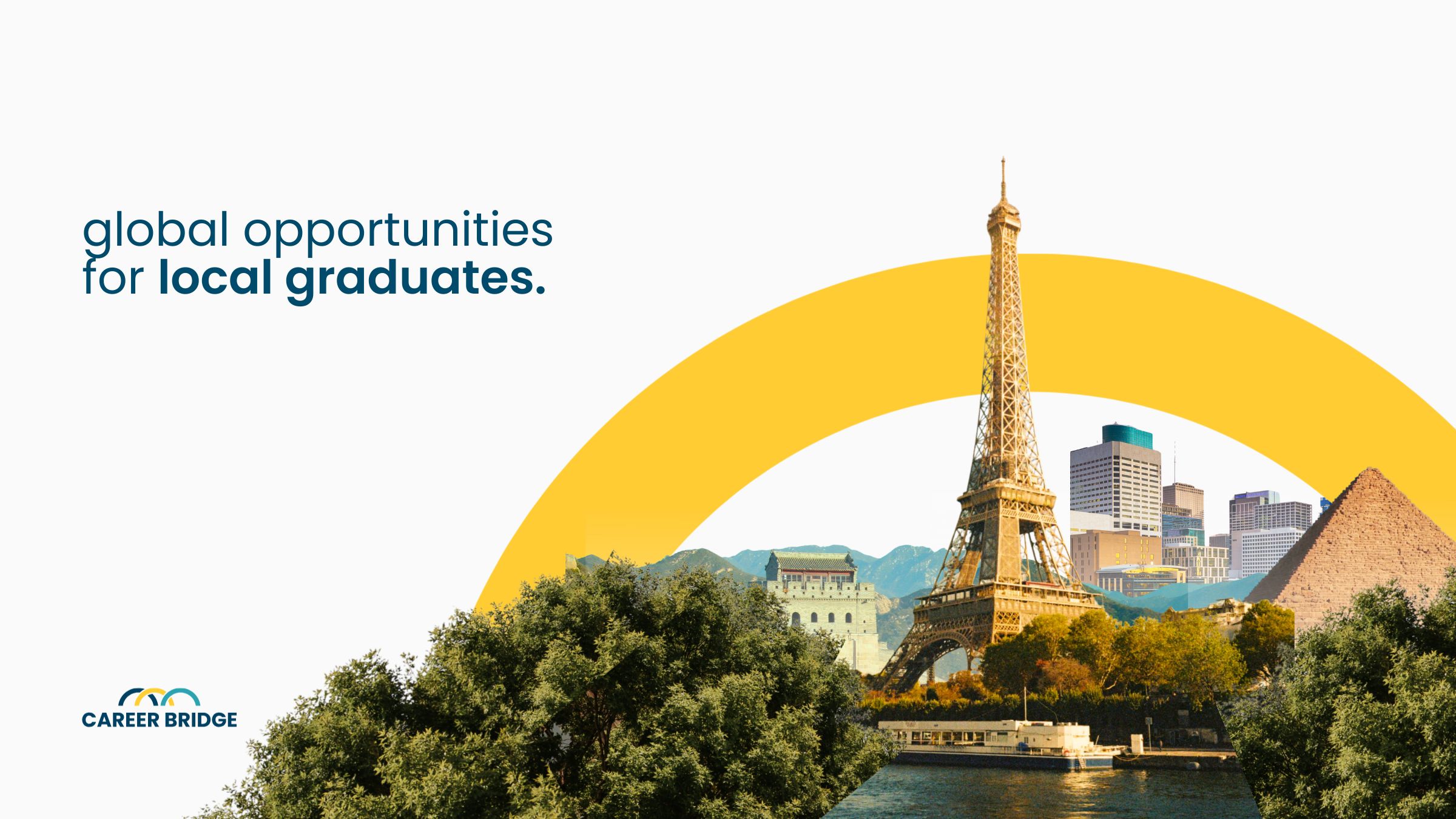
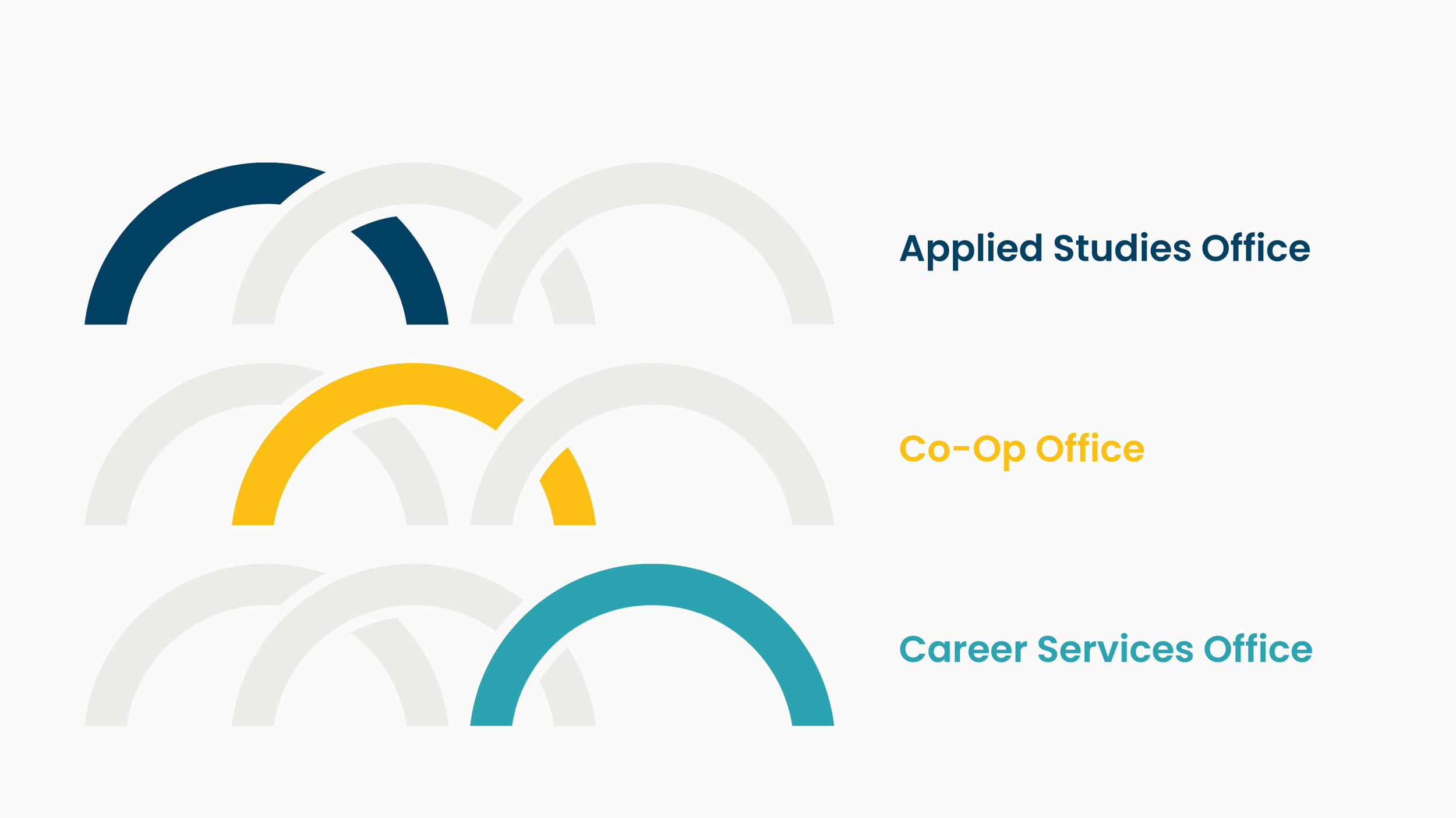
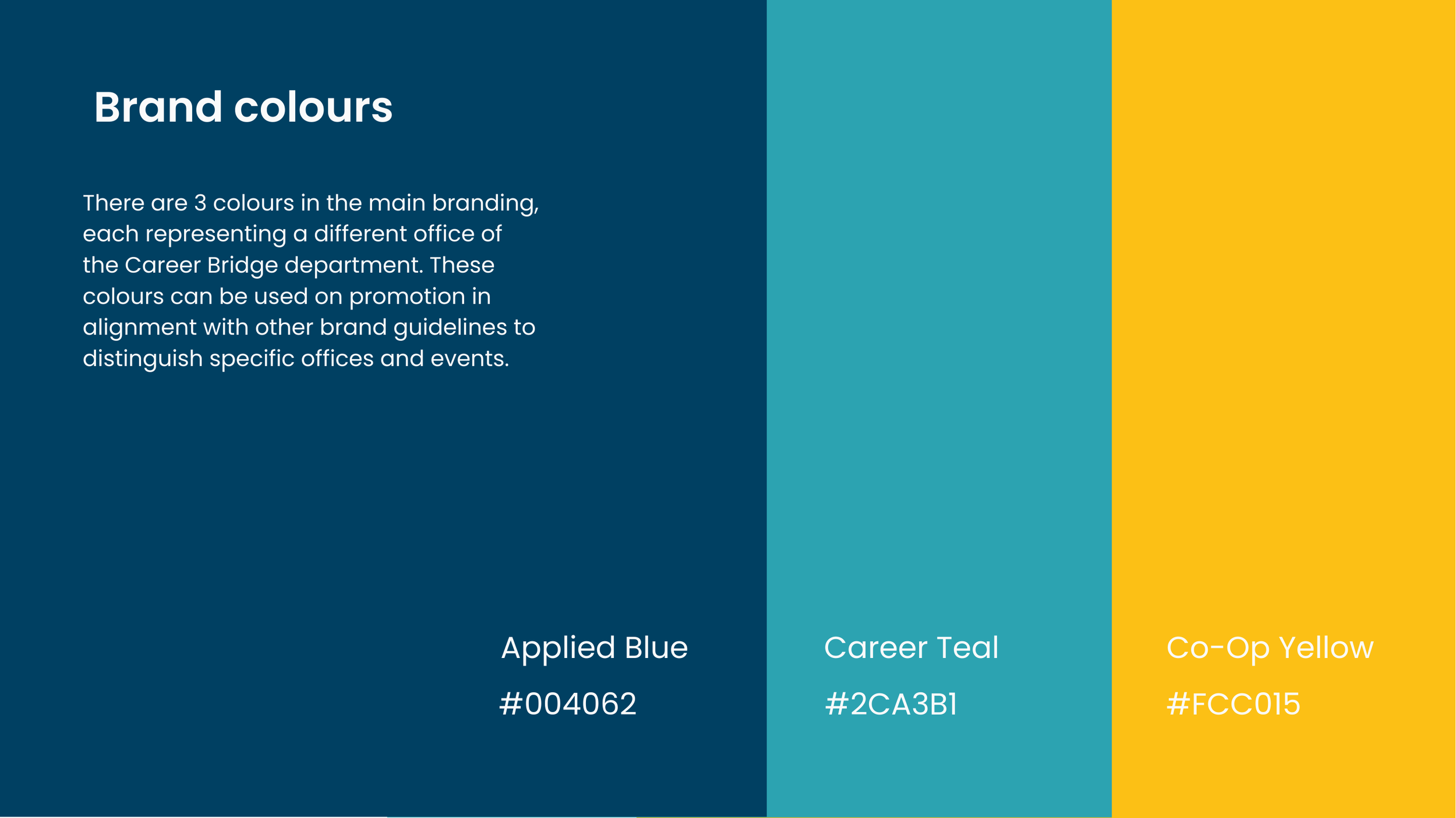
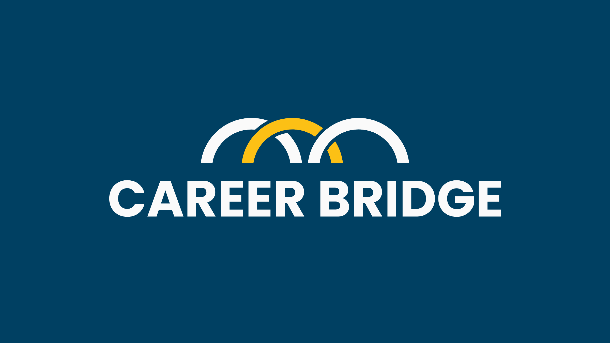
Creating the branding for Career Bridge focused on visually representing connection, growth, and progression within the university’s career department. The core visual element is an arch shape symbolizing the bridge itself, expanded into three distinct arches in different colours to represent the three offices and phases of Career Bridge: Applied Studies, Co-op, and Career Services. This structure reflects the student journey, from exploration to experience to career readiness, while maintaining a cohesive system across all touchpoints. The branding also incorporates the gifted Blackfoot name for the department, meaning Beautiful Golden Eagle, as a subtitle included on all promotional materials, grounding the identity in cultural significance, respect, and a sense of aspiration and forward movement.
Launching February 2026.
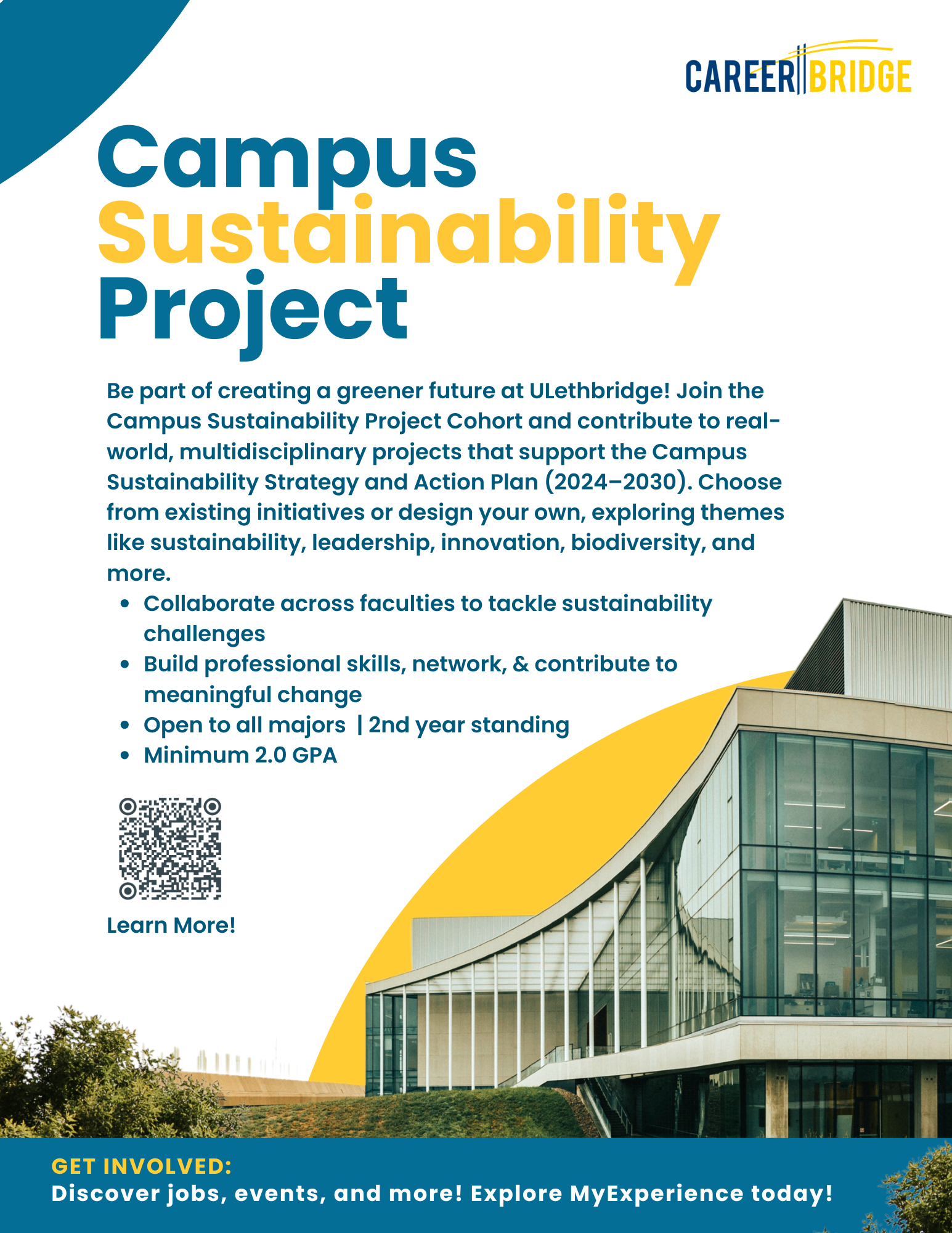
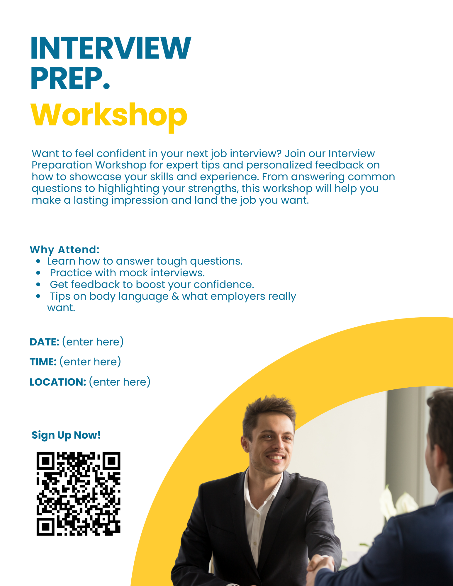
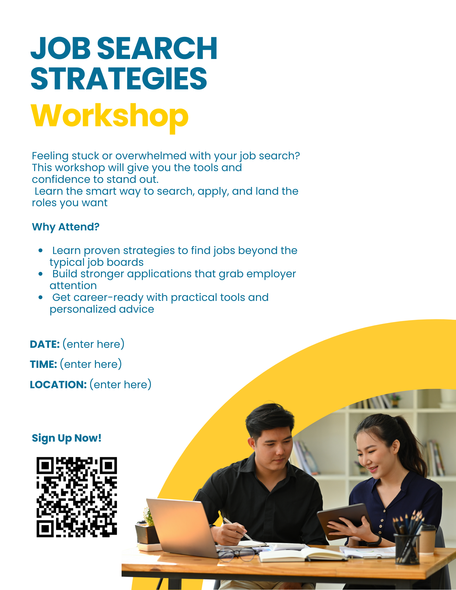
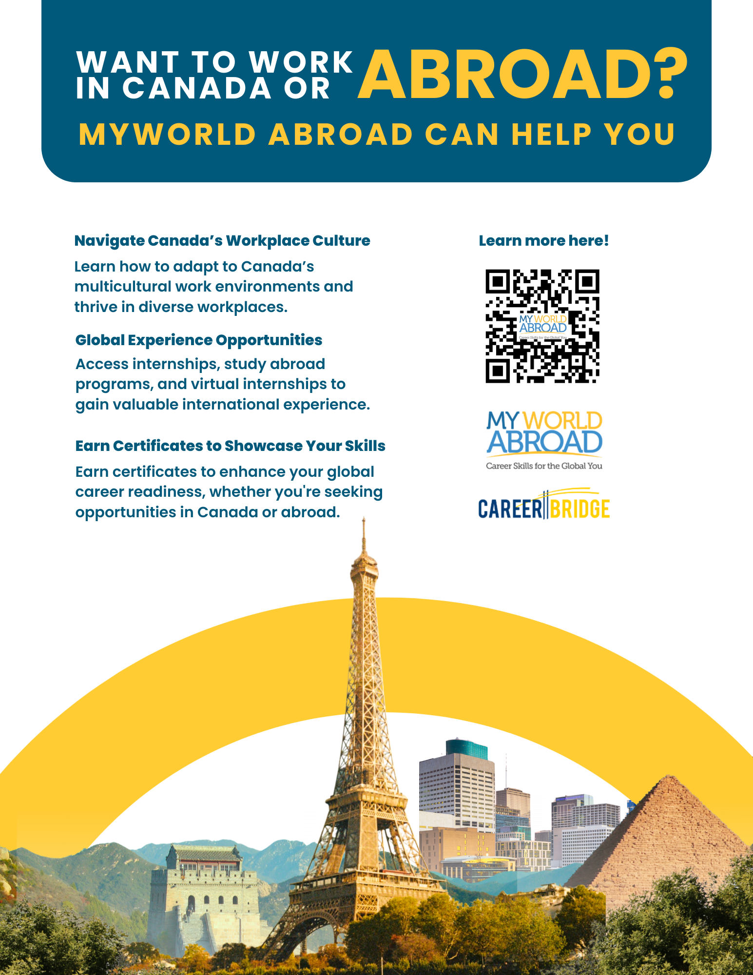
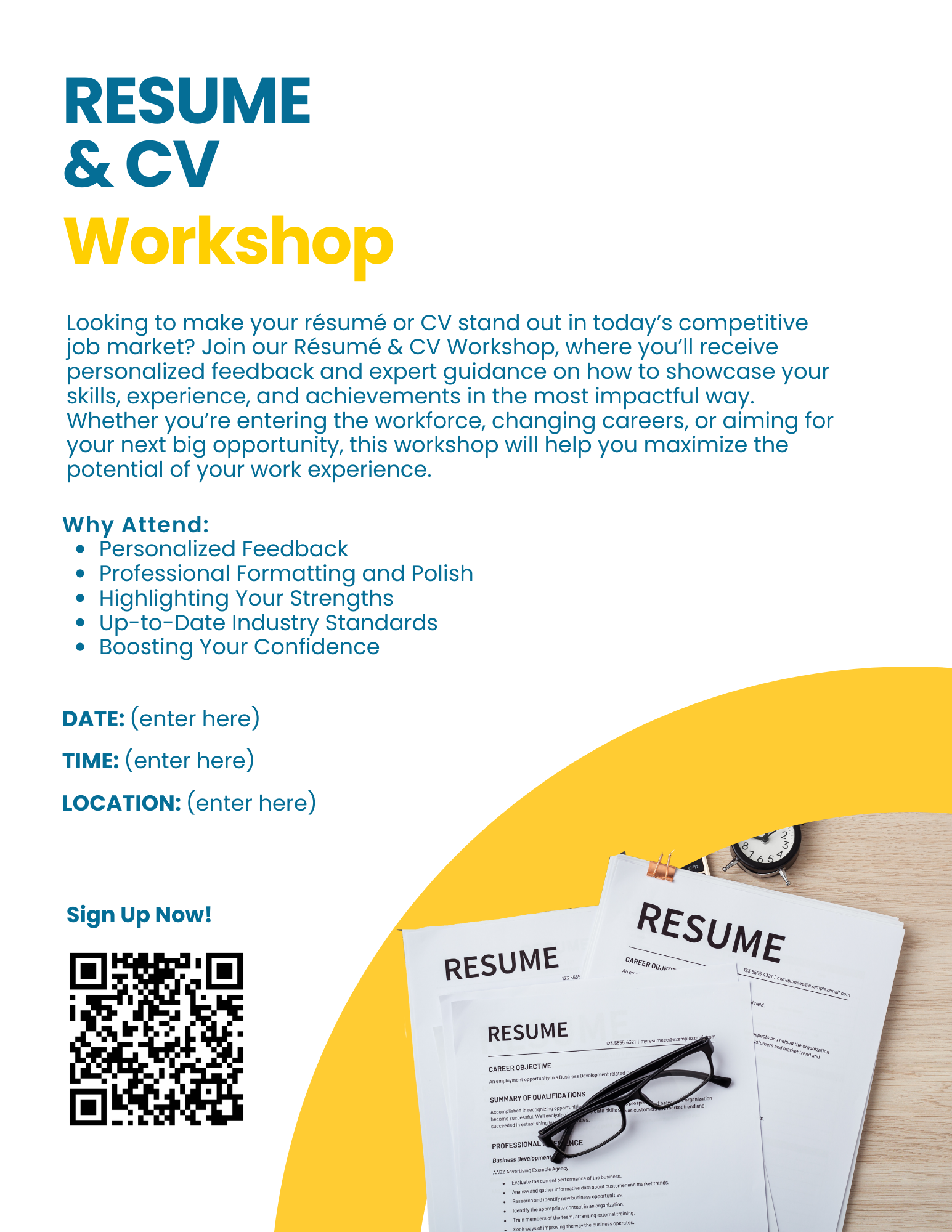
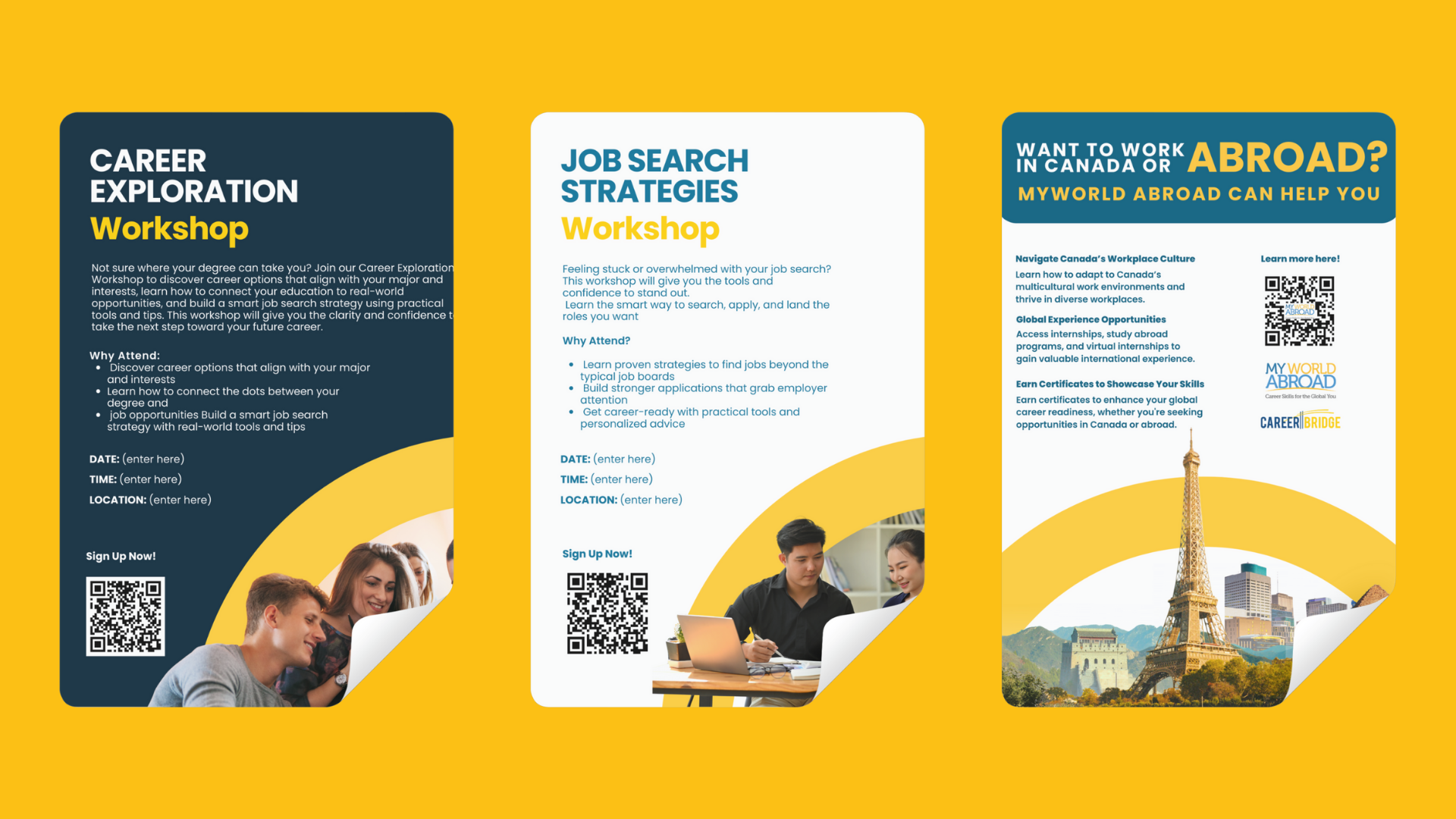
Designing for Career Bridge involved creating a cohesive suite of print and promotional materials that functioned as a unified system rather than isolated pieces. The project spanned brochures, posters, flyers, and bookmarks, each designed to stand on its own while reinforcing a consistent visual language across both digital and physical touchpoints. Careful attention was given to hierarchy, typography, and repetition so information could be easily adapted to different formats without losing clarity or impact. The result was a flexible collection of materials that worked in unison, allowing Career Bridge to communicate clearly across campuses, events, and online spaces, while maintaining a recognizable and professional presence regardless of scale or medium.
This project was developed through close collaboration and consultation, prioritizing respect, listening, and shared understanding throughout the process. I worked alongside Indigenous Elders, consulted with students, and collaborated with the University of Lethbridge team to ensure the branding aligned seamlessly with the university’s full rebrand while still maintaining its own identity. This collective approach ensured the final outcome felt authentic, culturally respectful, and genuinely representative of the community it serves, resulting in a brand shaped by the voices and values of those connected to it.