200k+
impressions
35%
booking increase
1
new brand
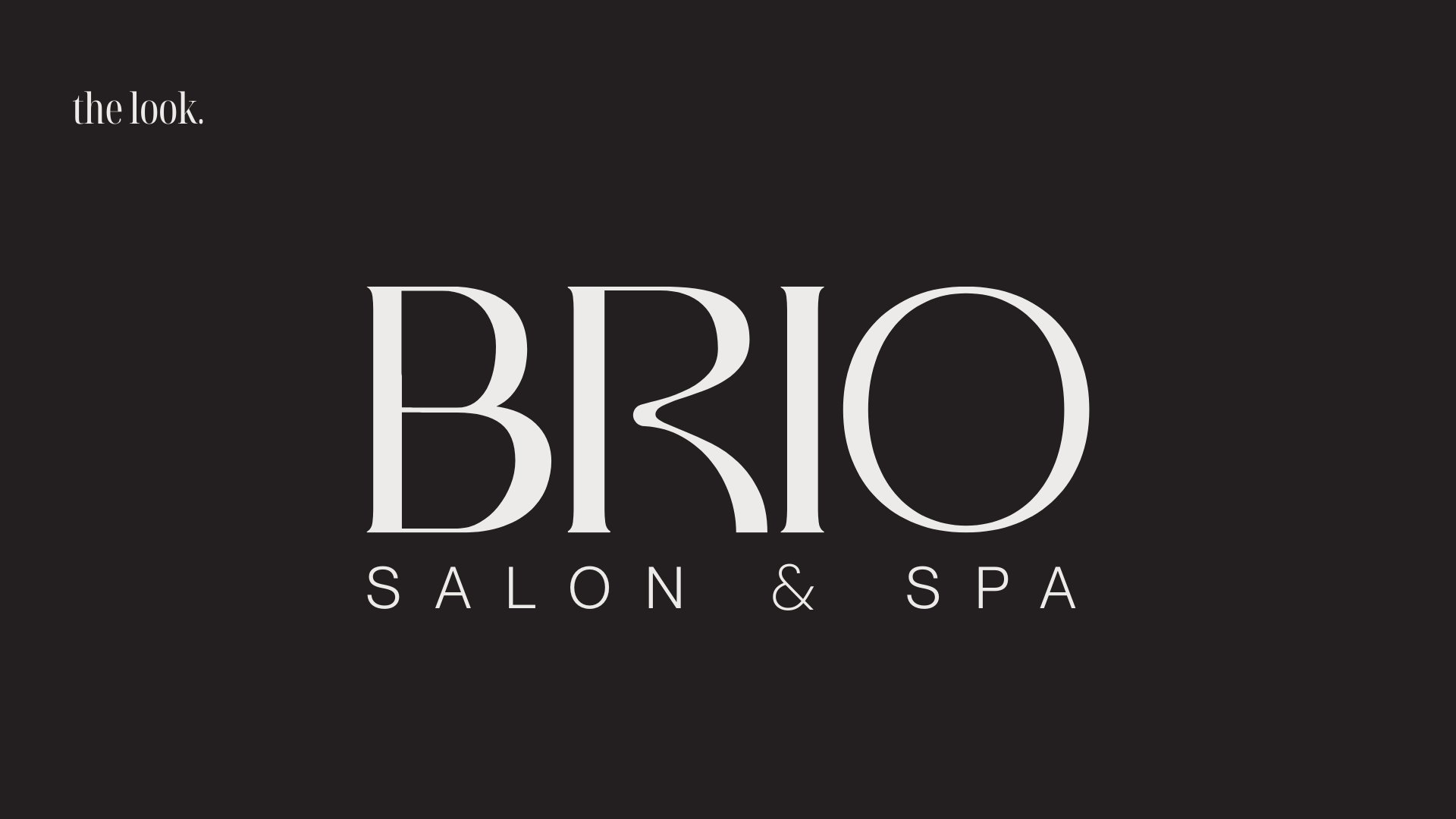
Brio Salon & Spa - Full Rebrand
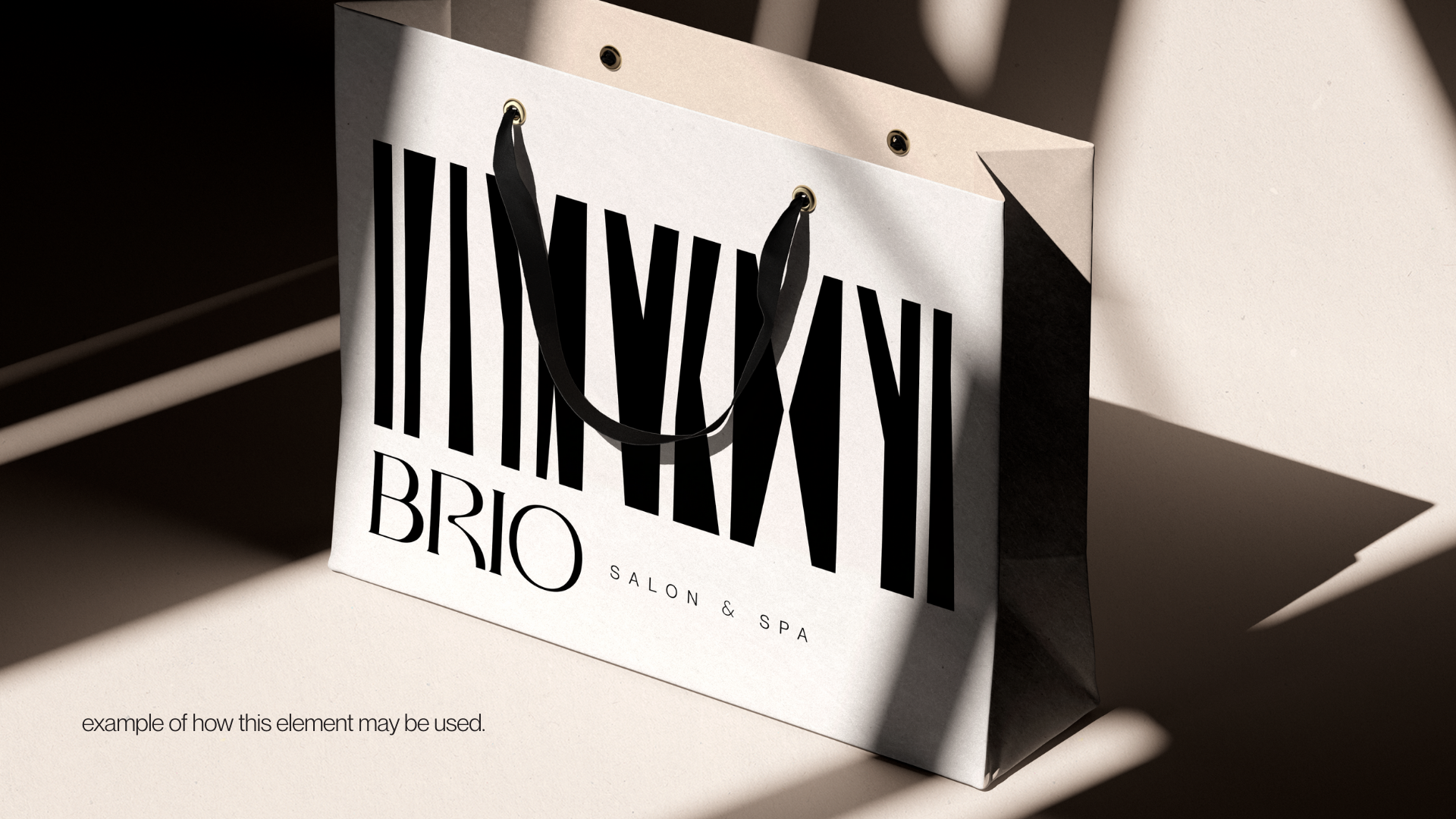
Over the past year, I had the privilege of working closely with Brio Salon and Spa on a full rebrand, and it was an honour to be trusted with such an important step in their evolution. This rebrand is complete with new logos, icons, imagery, and typography.
The rebrand drew inspiration from organic, natural shapes and a grounded colour palette, reflecting Brio’s deep commitment to wellness and sustainability, as well as their use of environmentally conscious products. As part of the visual identity, I also incorporated their well-known 3rd Avenue sign, an iconic element that’s become part of their story and presence in the community, transforming it into a distinctive graphic symbol within the branding package. This balance of fresh, modern design with meaningful nods to Brio’s roots created a brand that feels both renewed and authentic, ready to connect with a younger audience while staying true to the loyal guests who have supported them for years.
Launched September 2025.
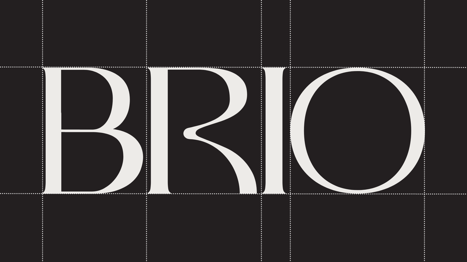
The new logo was designed to feel familiar while introducing a softer, more natural evolution of the brand. Maintaining the salon’s recognizable black and white foundation, the identity was refined through a custom palette of warm greys and creams to create a more organic and elevated visual language. This shift reflected Brio’s commitment to environmentally conscious practices and naturally derived products, creating a mark that felt modern, timeless, and aligned with the values of the salon.
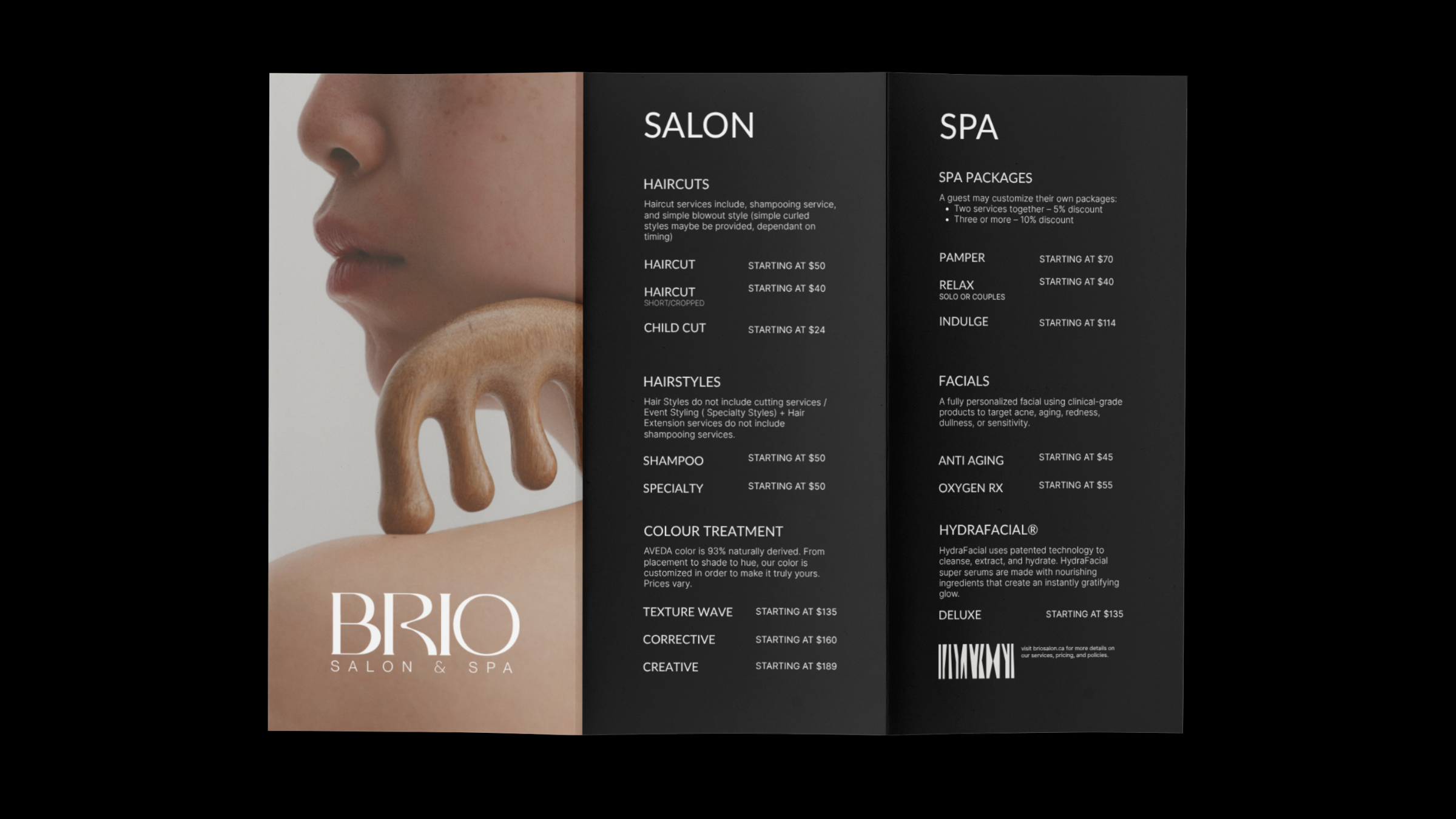
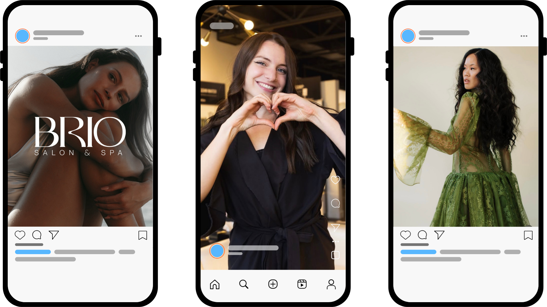
The rebrand extended across every customer touchpoint, from the development of a new salon and spa menu to branded packaging, apparel, and promotional materials designed to transform Brio from a service-based business into a complete lifestyle experience. Social media became a key extension of this identity, with a strategy focused on capturing in-house photography that reflected the new art direction while seamlessly integrating carefully selected stock imagery. This created a cohesive digital presence that felt intentional, elevated, and recognizable across every platform.

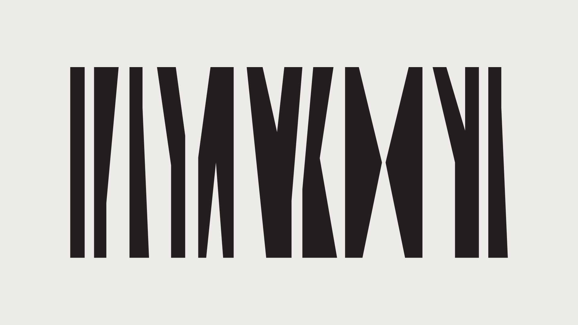
A throwback to their original and iconic 3rd avenue signage, this brand graphic was created to remind guests and staff of where they began as they transition not just into a new location, but into a new chapter of their story. This simplified graphic takes Brio’s minimalist ‘forest’ sign and turns it into a versatile piece of iconography to be used across the brand and promotional materials.
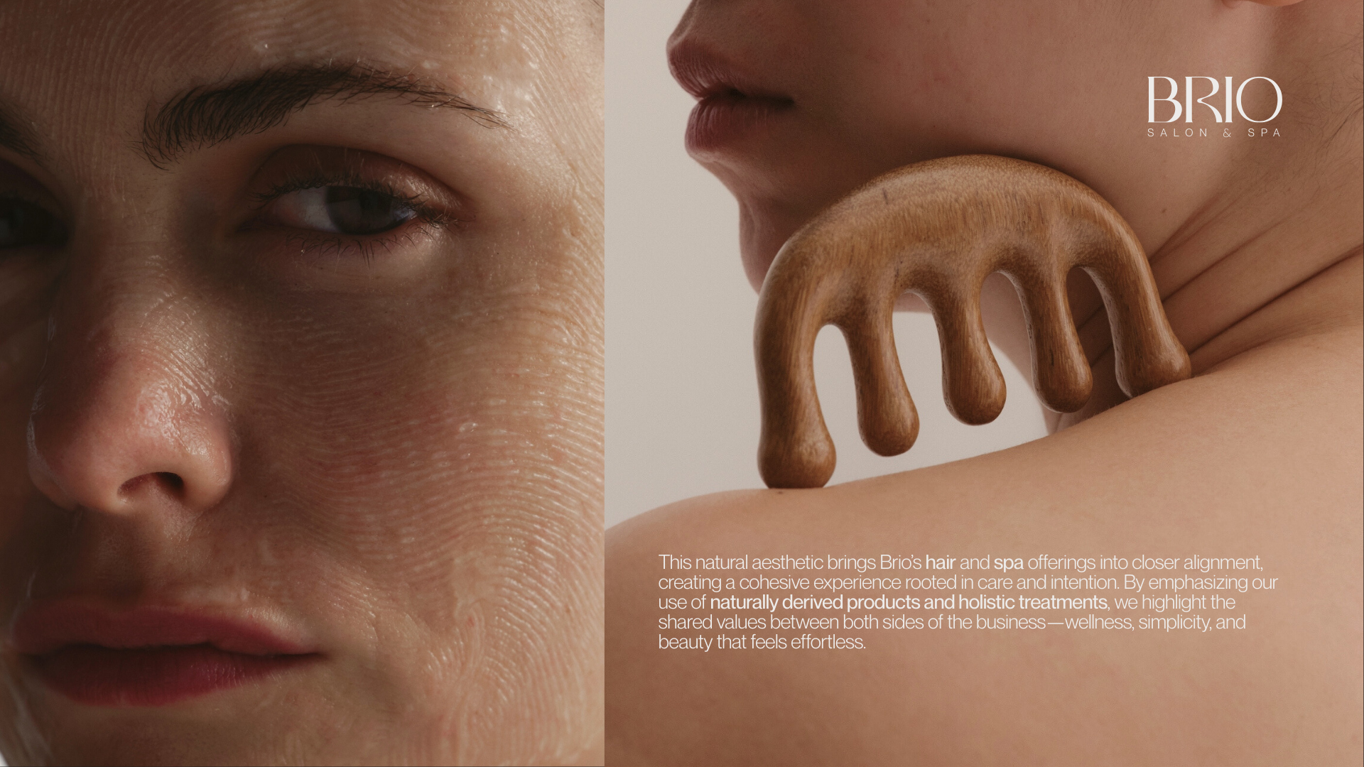
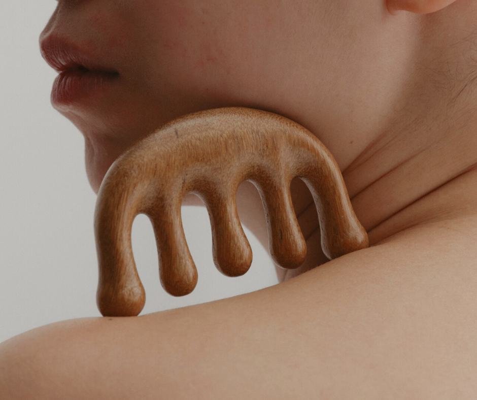
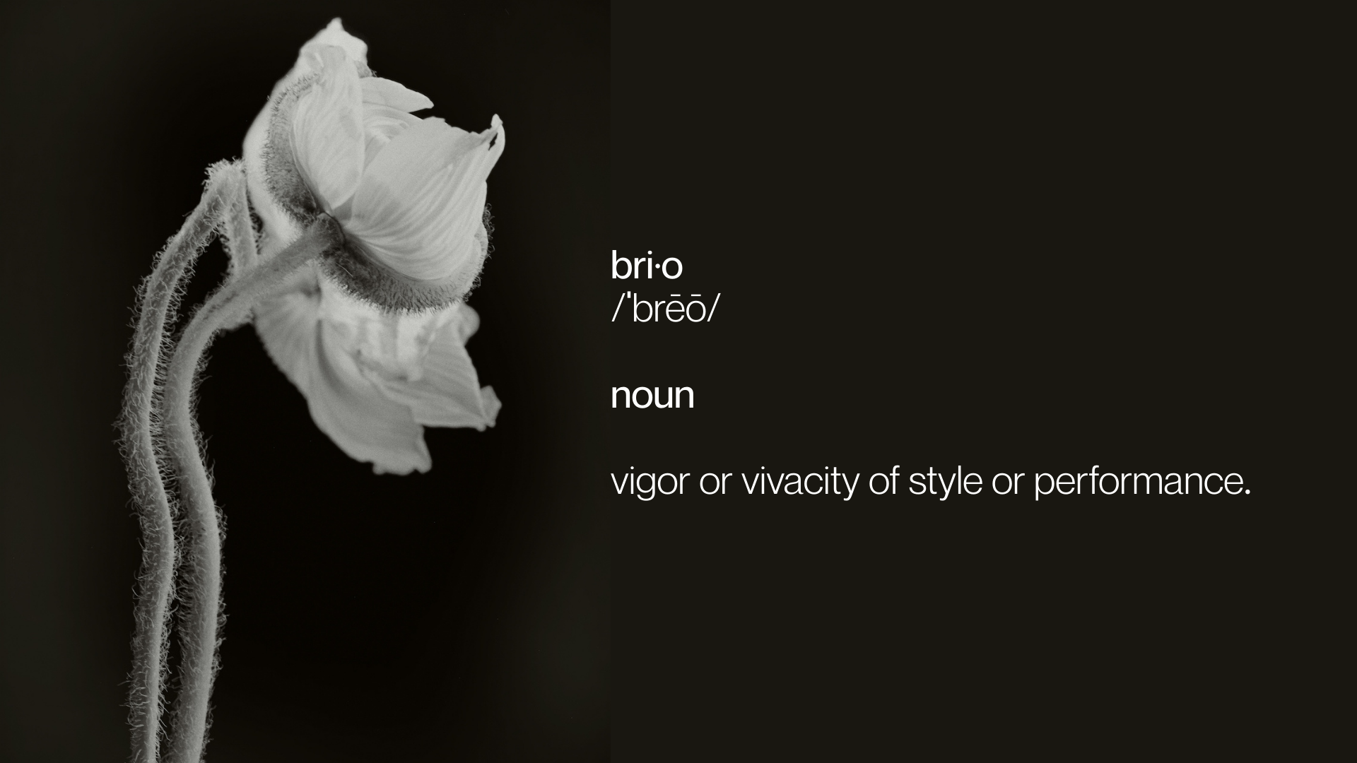
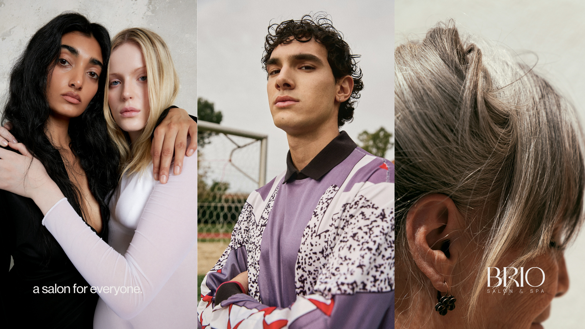
The art direction established a new visual world for Brio, combining unique floral elements, softer natural photography, and intentional styling to create a more aspirational brand experience. A key focus was ensuring the photography represented a diverse range of hair types, textures, and styles, allowing the brand to connect with a wider audience while supporting the salon’s growth into barbering and increasing male bookings. The visual system worked alongside the refined logo to create a distinct identity that moved beyond traditional local salon marketing, positioning Brio as a lifestyle brand inspired by the worlds of beauty, fashion, and wellness. Taking cues from brands such as Aritzia and Saie Beauty, the goal was to create a sense of belonging and aspiration around the experience of the brand, not just the services offered.